Cherry Blossoms – April 5

On April 5th, from 6:00-9:00pm, come see Joel’s collaborative painted stoneware on display at Paige Dansinger’s “Cherry Blossoms” gallery exhibition in the Minneapolis Skyway Mall.

Paige-Dansinger-Paintings-Joel-Cherrico-Artist-Tableware-2013-Gallery-Paige1

Gallery Paige is located at 811 LaSalle Ave in Minneapolis. The space functions as both a gallery and studio for Dansinger. A world-renown painter and digital artist, Dansinger was included in the museum exhibit, Gutai: Spledid Playground, Card Box, at the Solomon R. Guggenheim Museum, NYC. She has also performed her artwork during residencies at the Worcester Art Museum in Massachusetts, the DeCordova Sculpture Park and Museum in Boston and New York’s Brooklyn College.

Paige Dansinger, Artist Collaboration, Cherrico Pottery

For her current collaboration with Cherrico Pottery, Joel throws clay bowls, platters, and plates for Paige to paint on with glaze materials. He then brings the painted bisqueware to his studio in St. Joseph for firing, and returns the finished pieces to exhibit in Gallery Paige.

Collaborations like these bring Joel’s work in conversation with the larger contemporary art world. His work with Paige not only diversifies his art, but Paige’s paintings come alive on Joel’s 3D pottery surfaces, meant for display and as functional dinnerware. When it comes to the collaboration, Joel says he feels honored to create pottery as canvases for Paige’s iconic paintings.

Paige Dansinger, Joel Cherrico, Image 5

Painted Stoneware, Paige Dansinger, Artist Collaboration

 .

Stoneware_Painted_Plates_Paige_Dansinger_and_Joel_Cherrico_Artist_Collaboration_SKU_316_Image_4__04031.1381113651.1280.1280

Check out the process shots below to see how these two artists come together to make beautiful works of art:

INSTAGRAM Paige Dansinger, Joel Cherrico, Image
Joel first brings unglazed bisqueware to Paige’s studio for her to paint with glaze materials. Raw clay becomes bisqueware after it’s been fired once.
IMG_4296
Paige then paints each piece using underglaze materials. Her paintings typically feature a pallet of bright, playful colors and images.
Paige Dansinger, Joel Cherrico, Image
After Paige paints each piece with underglazes, Joel brings the painted bisqueware back to his studio and covers it with a coat of clear, glossy glaze. This will give the finished pieces a shiny, smooth surface after firing.
Paige Dansinger, Joel Cherrico, Image 6
At this point, the pieces are ready for 2200 degree firing. Joel uses an electric kiln to fire all his collaborative painted stoneware.

 The finished pots will be exhibited April 5th at Gallery Paige in Minneapolis!

Ogres, Princesses, and Pretty Blue Glazes

I remember the first time glazing a pot in Sam Johnson’s ceramics class last year. I had made this slightly uneven coil vase with pockmarked walls nearly an inch thick. The piece was truly ugly, an ogre really, but I couldn’t see the pot as anything other than beautiful. It was my Princess Fiona and I was its Shrek…At least until I glazed it.

Like most naive ceramics students, I pictured glazing just like painting. I picked out a handful of colors using the test tiles as my guide, and then brushed swooping glaze patterns all over my vase. By the time I finished, the pot looked like something straight out a kindergarten arts and crafts class. I on the other hand thought it was a masterpiece – a trophy of abstract art. When the thing (it was beyond a pot at this point) finally came out of the kiln, it was hideous. I looked over at my professor for encouragement. Sam walked over, took one look at my monster, turned to the class and said:

“Opening a kiln can be like Christmas or Halloween. Either the pots look amazing and you fall in love, or the results are horrible and you want to smash everything.”

Kiln Loading 2
The moment of truth, loading a kiln of glazed pots.

Unlike my great clay ogre, Joel can’t afford to make ugly pots. He makes his living through pottery, and as a result, his experiments with glaze need to be calculated and precise. He needs to know exactly how each part of the glaze works; how copper, cobalt, and iron make red, blue, and rust colors when the glaze reacts with fire in the kiln. Glazes transform clay bodies from ogres into princesses. However, as Joel continues to explore glaze chemistry, he finds that these potions are often difficult to create. Like the alchemists I wrote about last post, Joel works tirelessly to find the right balance of form and color that’ll turn a clay body into a beautiful work of art. For his livelihood, each glaze must reach for a certain standard of beauty.

Glaze Notes
– Studying past glaze recipes, tweaking the ingredients to make more alluring pots.

Looking back at his previous body of work, I think Joel’s been chasing this certain type of beauty all along. It’s been hidden in his work throughout the years, and now I feel we’re just starting to uncover it in the color blue.

Take a look at the gallery below to see an evolution of this blue color. Even in woodfiring, salt firing and copper red glazes, the color blue shows up. I can track the color throughout his work back to 2008:

2008, Oceanscape Cups    2009, Mindscape

Copper Red Glazes, Salt and REduction Fired, Joel Cherrico Pottery

2011 planter and jar, Cherrico Pottery

Paige Dansinger Collaboration  Collaboration with Bruno Press

Numerous potters talk about the lore of blue pottery. Throughout the ages, potters can’t seem to shy away from it. I’ve heard some contemporary potters even refer to the color as cash-flow blue.

Our text book this semester has been Bernard Leach’s A Potter’s Book. Now a 50 year old text, Leach provides a rich history of how ceramics has evolved. His book not only offers rich lessons of the past, but it also gives insights into the future. But even Leach, who wrote the book after decades of experience under his belt, could not seem to understand the lure of the color blue in ceramics. These stories share his experiences with blue glazes:

“At my St. Ives workshop each summer we are asked by three visitors out of four for colour and yet more colour, blue and the more intense the better, is easily the favourite.”

– A Potter’s Book, page 36

“Yesterday we had a good bunch of people, 2 of whom at least knew a good pot when they saw it. One woman started by asking if we hadn’t got any ‘blue pots’, and when David showed them that the last olive-blue glaze for which we have experimented for years, she said: ‘Oh! Do you call that blue?'”

A Potter’s Book, page 227-228

Perhaps what this all boils down to is something we talked about in the beginning -the pursuit of beauty. Some of the best potters in the contemporary art world don’t make beautiful work. Their work is strange, ugly and confusing.

Poster, NCECA, Joel Cherrico Pottery, Handmade Ceramic Pottery, 2014With this in mind, does the color blue still have a place in the contemporary ceramic world? This poster sits above our workspace, and it’s made from postcards Joel picked up in Philadelphia in 2010 at NCECA (National Council for Education for the Ceramic Arts). It gives a snapshot of the contemporary ceramic work, and shows only a handful of simple, blue pots. Joel will be at the conference in Milwaukee next week networking with contemporary potters and pottery enthusiasts. His goal is to show that the color blue continues to have a strong lure in both historical pottery as well as contemporary ceramics. He wants his work to be a bridge between historical potters like Leach and contemporary artists like Paige Dansinger. As a result, we’ve prepared some innovative market ideas, re-designed the website home page, and packed the online store with blue pots and artist collaborations with Dansinger. We’re prepared for the biggest ceramics conference in the country and we’re hoping to lure people to us with our blue pots!

Joel Cherrico Pottery Marketing Ideas, 2014  Joel Cherrico Pottery Business Card Coins

Joel Cherrico Pottery, Shot Cups, Innovative Marketing   Joel Cherrico Pottery, Shot Cups and Mugs, Innovative Marketing

Bernard Leach, A Potters Book, Beautiful Pottery, Joel Cherrico Pottery, 2014
Bernard Leach, “A Potter’s Book” (Page 7)

Finding a Balance in an Imbalanced Art World

Hannah Anderson worked as a “Pottery Marketing Intern” this semester. She is a senior Art major at the College of St. Benedict/St. John’s University. In this post, she describes our semester long task of trying to define the role of pottery in the contemporary art world. 

Guest Posting by Hannah Anderson (view her Linkedin page here)

Throughout my internship with Joel, we had many discussions of “high art” vs. “low art” and where his pottery fit into the mix. High art, one could argue, is not functional for the consumer. Traditionally, the function for this type of art is to sit in a museum as a masterpiece, observed through this elevated status.  Low art is generally mass-produced, inexpensive, and far more available to the public. In my critical theory class, we discussed how museums have opinions on high and low art as well, and can influence how people view artwork by either appearing intimidating or more approachable.  

The terms “high” and “low” art should be reevaluated and adapted to today’s contemporary art world. Words that correlate with high art seem far too Renaissance or Baroque in feel, such as “master of art,” prestige, traditional, western, still-life, landscapes, portraits, and, my favorite, original.  This particular word poses the question: can high art even exist anymore?  I would argue that it certainly still exists, but not in the same light in which it was originally established.  High art and low art should be adaptable terms for each new generation of artists. Low art has synonyms such as: consumerism, production, affordable, advertised, ordinary, etc.  This is a challenge many artists face today, and it creates a huge imbalance in the art world. 

Joel poses the question, “why are we making and selling pots?” He gathers a lot of insight from potter Warren Mackenzie, whom also has a lot to say about art as a functional vessel vs. sitting in a gallery space. Warren is an 89 year old, world-renowned artist. He is most at ease with his work when he knows it is being used, handled everyday and looked at often. Pottery has the potential to be the most intimate of artwork, because it’s users have constant contact with it.  Clay is not expensive and is made from the earth, so when does it make the transition from low to high art?

Price plays a factor into what is high and low art.  Warren says “A 10 dollar pot, now that’s affordable.”  He says that if it breaks, then it is not a huge loss.  This is interesting coming from a renowned artist, because his philosophy conflicts with his position in the art world; his pots resell on Ebay.com for hundreds of dollars everyday. Mackenzie says, “Unfortunately, now I only sell through galleries.” His philosophy seems more focused on low art, but his standing is high.

Bernard Leach, A Potter's Book, 1940, Joel Cherrico Pottery
Bernard Leach, “A Potter’s Book” 1940 – Pottery mentor to Warren Mackenzie

I like to think that many artists in today’s art world present a mix of high and low art, and it is perhaps just difficult to find the balance.  Right now, an imbalance is evident in Joel’s artwork. His pottery is functional, consumer-friendly, priced lower than most professional potters, and is meant to bring a comfortable aesthetic to anyone’s home. His online store is in contrast with this idea, because we take a high art approach by using professional photography equipment to shoot pots in front of a gradated background. We then use these photos to try and join the contemporary art world.

I wonder, is the Local Blend pottery high or low art? At the Local Blend coffee shop, they use Joel’s pottery in mass, so anyone can eat and drink from his pottery everyday. This seems much closer to low art to me. We take the same pots and put them in front of a gradated background, making them high art in a different atmosphere.  Without a little low art, high art wouldn’t be possible, since the Blend is where most of Joel’s income is generated. Writing about this venue has also brought him some of his biggest successes in the art world, including 2 major magazine publications. Perhaps these everyday pots will someday be elevated to a high art status?

Low art is what’s paying the bills, yet in the future, Joel wants to support his livelihood with a balance between low and high art. This means more of his income needs to be generated from our work on the online store. One way we accomplished this was by branding his artwork in a more focused way, using one glaze: the Nuka Glaze with iron. Nuka with iron had a great deal of success for Joel throughout my internship, enough for him to narrow his focus toward solely that glaze. Currently the online store has less Nuka with Iron than Joel would like, and his future plans are to recreate his online store geared toward pottery of only that glaze type.  Over 50% of the online sales were Nuka with iron, and Joel sold pots with this glaze type to five different people both locally and nationally in one week. He has also completed 4 dinnerware sets in this glaze, 2 of which were sold through wedding registries. We see huge potential in this glaze combination.

IronDippedWineCups, SKU#326, Image 2

Nuka Glaze with Iron, Joel Cherrico Pottery, 2013 Nuka Glaze with Iron Stoneware Mug, Joel Cherrico Pottery, 2013

This branding was influenced by Ayumi Horie, who certainly has a recognized, established, successful brand for herself. Her style is easily recognizable on every pot. Her artwork sells at high prices online and is always sold out in less than a day. Moreover, Horie has earned her place in the art world through years of consistent craftsmanship, a huge resume, and skillfully writing about her craft in major publications.

Our experience with high art continued through Paige Dansinger– an internationally renowned painter and art historian who is collaborating with Joel. She makes high art in the form of painting on canvas, digital paintings on IPads, projections, performance, and most recently, painting with glazes on Joel’s pottery. During my internship, she opened a gallery in the Minneapolis Skyway Mall called Gallery Paige. Everyday, she exhibits and sells her artwork as high art. The collaborative work made by herself and Joel has huge potential to take off in the high art world.

BlogPostImage1  Handmade_Painted_Plates_Paige_Dansinger_and_Joel_Cherrico_Artist_Collaboration_SKU_317_Image_1__50351.1381113981.235.275Paige Dansinger Painting on Plates, Joel Cherrico Pottery, Handmade Ceramic Painted Plates

Paige-Dansinger-Paintings-Joel-Cherrico-Artist-Tableware-2013-Gallery-Paige-Van-Gogh

To conclude, perhaps in today’s world, the balance needs to be found in the middle of the spectrum between high art and low art.  Are the best artists those who spend their time making both high and low art? One could argue that they can reach the most amount of people that way.  Because that in fact is what art is all about: reaching the most amount of people with a particular message. The meaning of art and its purpose to be seen can easily get lost when identifying it as either high or low.  As renowned potter Bernard Leach said, “To me the greatest thing is to live beauty in our daily life and to crowd every moment with things of beauty. It is then, and then only, that the art of the people as a whole is endowed with its richest significance.”

Not Your Typical Cold Call: An Inspiring Conversation with an Elder Potter

Last Wednesday afternoon I was attaching some handles to mugs and I got a strange call from a number in New Hampshire. Normally I let out-of-state calls go to voicemail because it’s often spam. For some reason I decided to wipe the clay off my hands and pick up.

The man on the line was Bruce Dix. He was Google searching a potter named, “Hong Jae Pyo” and he discovered my work. He asked, “Have you ever met this guy? Did you host him at your studio?” I said, “Bruce I don’t really have a studio, today I’m making pottery in my 3rd floor apartment. I’m only 25, I got the pictures of Hong Jae Pyo from a friend and just put them on my facebook.” Then Bruce said, “Oh so you’re a young guy, huh? Well I’m 65 and I’ve been a potter my whole life. I’ve gotta give you some advice while I’ve got you on the phone.”

This was the start of an hour long conversation about Bruce’s life as a potter.

The internet is so crazy. Hong Jae Pyo was a Korean potter practicing Yi Dynasty ceramics, and he toured the U.S. in the late 80’s. My only relation to him was by posting 2 images of his work on my Facebook page, because I’m really interested in his Copper Red glazes…we’ve never met, we’re not “tagged” together in any pictures. I simply typed “Hong Jae Pyo” as the image description and it was enough for Bruce to find him in Google, find my phone number on my website, and shoot me a call.

Hong Jae Pyo, Pottery Throwing Demonstration, photo by Kenneth Furber    Hong Jae Pyo, Pottery Throwing Demonstration, photo by Kenneth Furber, 2

Bruce went on to describe the time he spent with Hong Jae Pyo and 2 other Korean potters that were on tour with him.

“They were traveling to colleges to give demonstrations, eating Coke and Pizza, I could tell that they were really uncomfortable. They lived in small Korean villages with locally grown, good food. I invited them back to my place and cooked them a feast.”

Bruce went on about the potters. “I had porcelain, stoneware, and terra cotta. Each potter used a different clay and we made pots for days. They spent time by the ocean, walked around outside, away from the city. They were really humble, nice people.”

Our conversation shifted to Bruce’s life and his desire to give me advice. I don’t remember everything he said word for word, but here’s what I took away from our conversation:

Pottery Insurance

“Take your best piece from each firing – the jewel – and put it in a box. In 20 years, you’ll have a show of these pots in New York City, sell $100,000 and be able to retire. Plus, you can pull these pieces out from time to time for inspiration. It shouldn’t be hard to keep from selling these pots right away. You have family heirlooms, you don’t try to sell these, right?”

$0.25 Mugs

“When I was your age, I sold my mugs for 25 cents each. If you can get $25 per mug then you’re doing great, keep going!”

No Art Festivals

Bruce never did a single craft fair.

Word-of-Mouth

“Eventually all of your customers will come to you, it just takes time- years and years. Try unconventional ways to sell your pots. Call one of the big banks in your city and politely ask to speak with someone in charge of marketing and corporate gifts. Put on a white, clean shirt, white pants, and bring them some of your pots.”

Colleagues, Not Competitors

“You should never have competitors, you’re never competing against other potters. Find the potters that you have similarities with and spend your time with these potters.”

Ignore Criticism

“As your career builds, you’ll start to get a lot more criticism. Ignore people who criticize your work. Don’t let it bring you down, just go find like-minded potters.”

———————————————————————————————-

You won’t find Bruce’s work online, he’s not interested in giving up privacy to get his pots out into the world.

Special thanks to Ken Ferber for originally sharing the images of Kong Jae Pyo that he snapped during a 1988 workshop. Ken let me photograph his images, as well as sections of a book that he bought during the workshop.

Joel Cherrico Blog Post, Bruce Dix, Kenneth Ferber, Rolling Stone, Jimi Hendrix, www.cherricopottery.com 01    Joel Cherrico Blog Post, Bruce Dix, Kenneth Ferber, Rolling Stone, Jimi Hendrix, www.cherricopottery.com 02 Joel Cherrico Blog Post, Bruce Dix, Kenneth Ferber, Rolling Stone, Jimi Hendrix, www.cherricopottery.com 03      Joel Cherrico Blog Post, Bruce Dix, Kenneth Ferber, Rolling Stone, Jimi Hendrix, www.cherricopottery.com 04 Joel Cherrico Blog Post, Bruce Dix, Kenneth Ferber, Rolling Stone, Jimi Hendrix, www.cherricopottery.com 05     Joel Cherrico Blog Post, Bruce Dix, Kenneth Ferber, Rolling Stone, Jimi Hendrix, www.cherricopottery.com 10

Pottery in The Office: Getting Pots Online, from A to Zip File

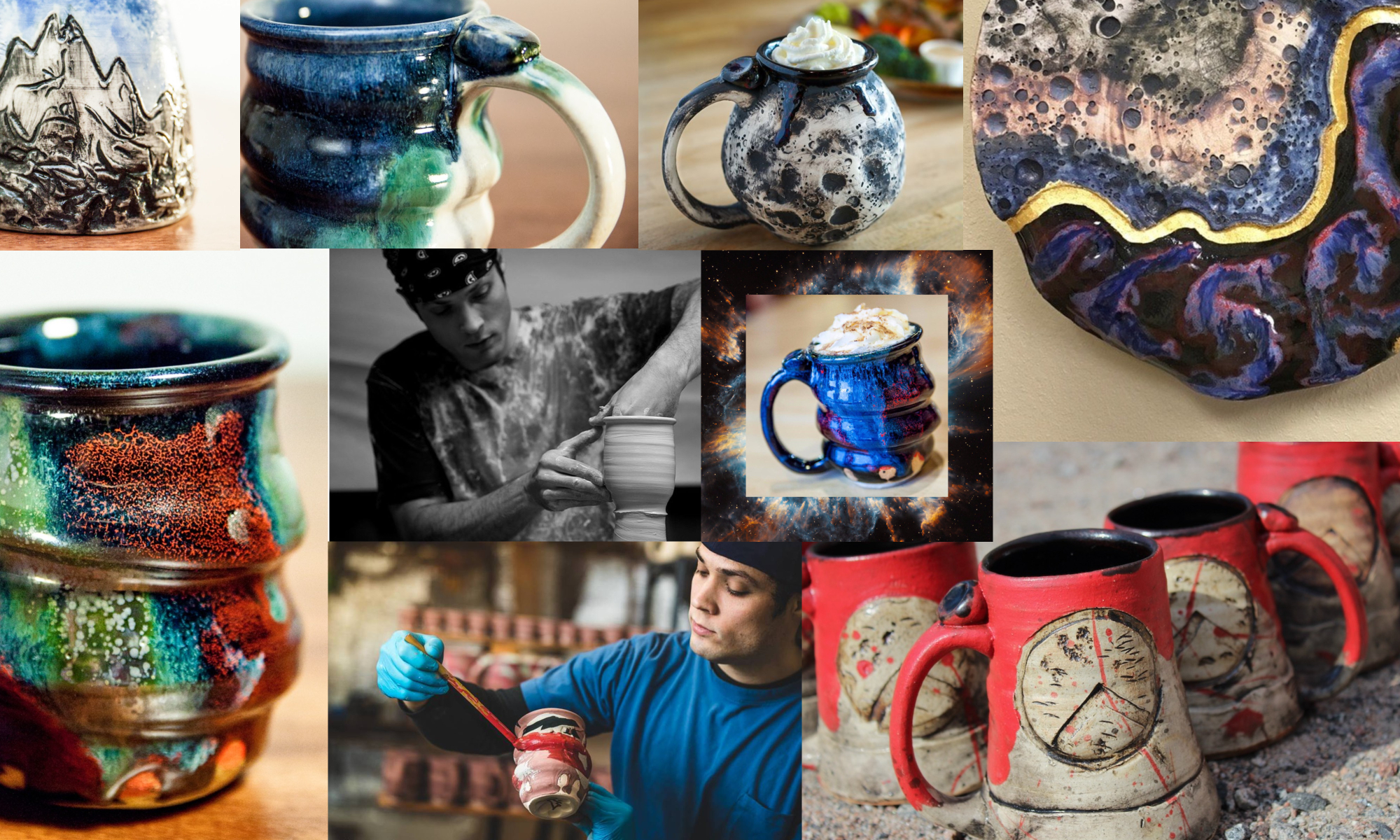
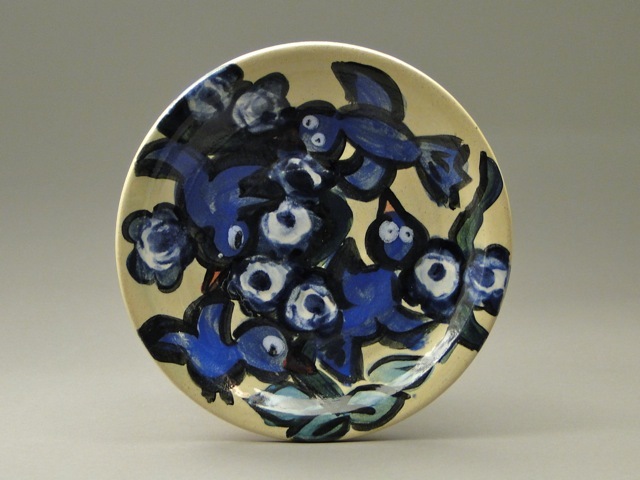
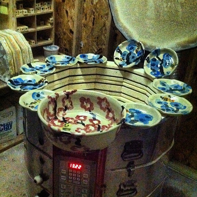
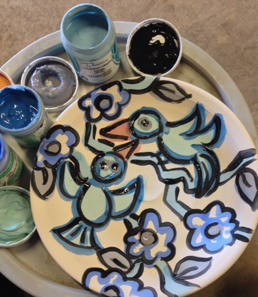
The contemporary ceramics world operates with a lot of high quality photos. Applications to national galleries, grants, exhibitions, and art festivals require professional images in the call for entry guidelines. Photography equipment was not part of most traditional pottery studios, but it’s a necessary tool for most potters today. These tools also create the opportunity to sell pottery online.

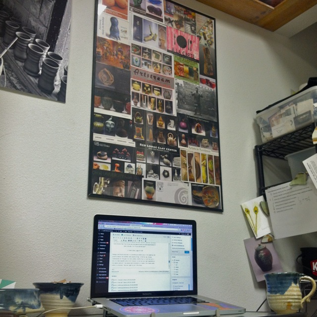
For these reasons, I began renting a small office space in downtown St. Joseph, MN in December of 2011. I found this space by contacting my old landlords and some realtors. The goal was just to find indoor storage with heat and electricity, because I was previously photographing pots in a storage container. I had no internet access, I plugged photo lights into my car adapter- not the best setup, especially with winter coming. Pottery in The Office, St. Joseph Laundromat, Photo by Sam JohnsonI eventually settled on one of the 5 small office spaces that were built along with the new Laundromat. This 15′ x 15′ office has wi-fi access, electricity and heat- a big step up from the storage container. The office is also decked out with a couple desks, my old computer, shelving (salvaged from local businesses and from craigslist) and a full photo setup. This is also a space to work with the Internship Program at the College of St. Benedict/St. John’s University. Ben Hillman, senior Management student and Pottery Marketing Intern, worked in this office space to practice daily operations for my pottery business. In this post, he outlines the setup and process of what it takes to photograph pottery and get it online.

Office Photography Setup

by Ben Hillman (view his Linkedin page here)

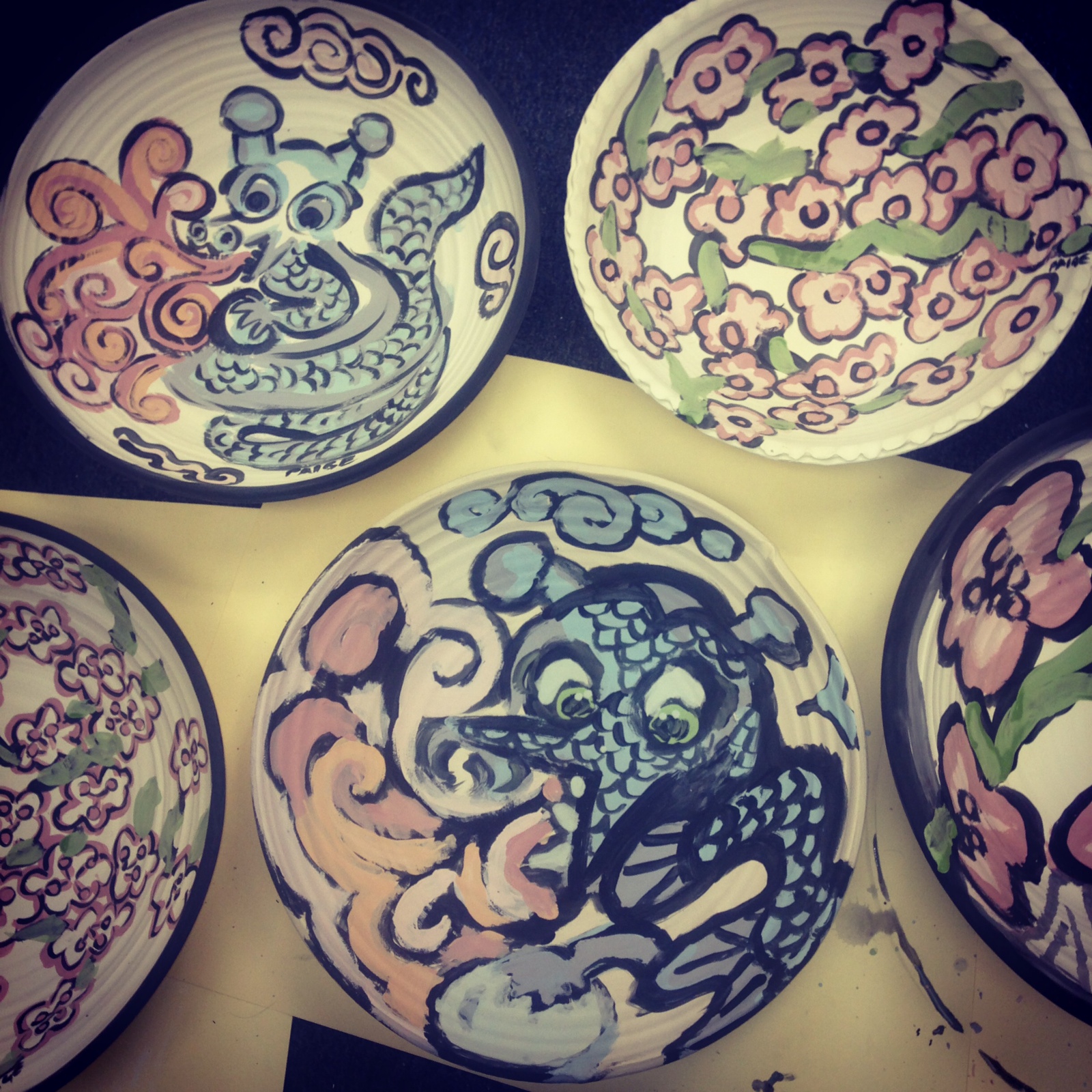
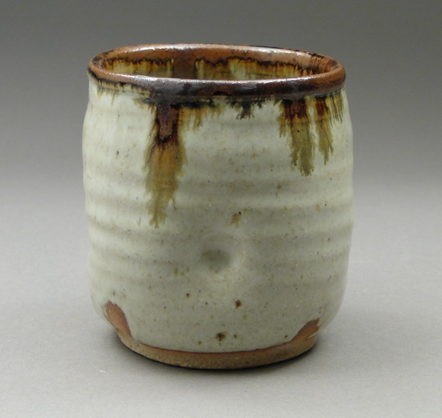
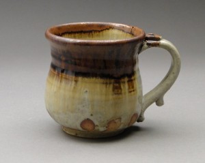
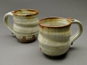
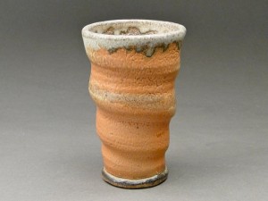
Since every pot that Joel makes is unique, it is important for us to use photography to convey as much information about each individual piece as we can.  Our goal is for every customer to have an accurate sense of the size, shape, color and texture of the pot that they are purchasing, so that there aren’t any surprises when it arrives.  This is the equipment we use to get pottery online:

1.) The Camera

We use a Sony Cyber-Shot DSC-HX1 for all of our photography slides.  The key settings that we make sure to adjust before shooting are the Mode, ISO, Noise Reduction, Aperture and White Balance settings.  Here is a basic summary of how these features affect picture quality:

  • Mode: Manual – allows for custom settings
  • ISO – increases the camera’s sensitivity and can make pictures more grainy
  • Noise Reduction – reduces the visibility of unwanted speckles, dots and smudges that appear as a result of the digital noise emitted by the camera
  • Aperture – controls the amount of light that passes through the lens and hits the camera sensor
  • White Balance – helps achieve true image color

Finding settings that best highlight the important aspects of your work takes some trial and error.  We make sure to keep track of our settings in a Google spreadsheet for easy reference, and to ensure that we get consistent pictures.

2.) The Background

The pots rest on an old coffee table that is covered with a grey sheet of photo paper ($40 from National Camera Exchange) extending up towards the ceiling behind the table:

Bounce board, image...1

The photo paper scratches easily, so you have to be careful placing, removing and organizing pottery on it. If a section becomes too scratched to use, it is easy to tear off and unroll a new sheet. In a previous photography setup we used a vinyl gradated background, but we found that it was more expensive and scratched too frequently due to the rough bottoms of many pots.

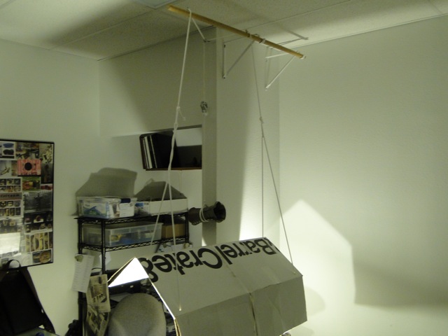
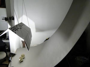
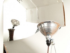
3.)  The Bounce Board and Lighting

The lighting setup features two clamp lights purchased at a local hardware store and a bounce board made from a curved piece of white cardboard. Joel got the idea for the clamp lights by reading about renowned artist Jeff Campana’s setup in “Turning Pots into Jpegs, Part One: The Setup.” We attach the lights to a couple of his sculptures on either side of the table and aim them up at the bounce board at about a 45° angle.

blog post photos, image 05   blog post photos, image 10

The bounce board then reflects the light downward and focuses it on the pots being photographed. It also helps create gradation in the background of pictures by cutting off the light at a certain height.  His inspiration for the bounce board came from Michael Coffee in his blog post titled “Shots of Pots on the Cheap and Low Tech.

The Process: How We Get Pots Online

1.) Adjust the Camera Settings

The camera we use saves settings between sessions and rarely leaves the office. The one feature we have to set every session is the white balance. Setting the white balance is important because it will help ensure the accuracy of the colors in your pictures.  If you don’t set the white balance prior to shooting, the camera can pick up different color casts from the lights you are using.  This causes pictures to have an unnatural red, blue, green or yellow shade to them, which makes it hard to discern the real colors of the pots. To set the white balance on our camera, we do the following:

  • turn off all lights except the ones being used to shoot
  • set the camera up on a tripod facing the bounce board
  • aim it at an all-white background (usually a piece of white paper)
  • go to the camera settings and click on the “set white balance” feature

The white balance must be reset every time you shoot, so don’t forget or else the color in your pictures will be off and must be fixed later in photoshop.

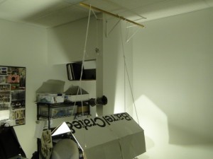
2.)  Adjust the Bounce Board

After the white balance has been set, we select pots to be photographed and arrange them under the bounce board.  Depending on the size of the pot, the bounce board may need to be adjusted to make the light strikes the pot in the right way.  Using a system of ropes that hold the bounce board above the table, we can adjust its height and angle for this purpose. It takes experimentation, but we find that this setup can provide both subtle gradation and heavy contrast.

3.) Shoot the Pottery 

  Shooting Photography of Pottery in the Office, Wedding Registry   Online Store Pottery Organized on shelving

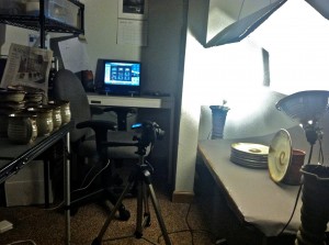
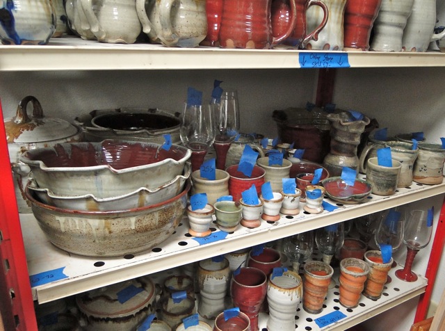
After the camera and bounce board are ready to go, we begin shooting.  We almost always shoot our photos at a downward angle so that we can convey the depth of each piece in addition to height and width.  Every pot is shot from multiple angles and several pictures are taken of each angle, so that we have plenty of pictures to choose from.  It is nice to have at least two photos of each angle, in case one of the pictures comes out blurry.  We also make sure measure and number each pot while shooting them, which helps keep everything in order for both the online store and shelf storage in the office. We number each pot with blue tape, and record the number and measurements in a Google spreadsheet.
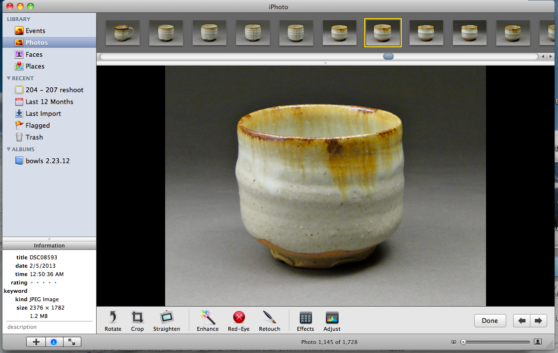
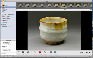
4.) Editing Photos

The next step in the photography process is importing and editing the photos.  There are many different image editing programs available for this, both free and for sale. Joel is a Mac user so we just use iPhoto, which comes standard on all Apple computers.  Although iPhoto isn’t the best image editing software available, it has the basic, necessary features and is very easy to use.  If we were editing photos to apply for an art gallery, grant, exhibit or festival however, we would use a more advanced program like Gimp. Gimp is great because it’s open source, meaning it’s totally free. It takes time to learn, but has almost every tool provided in Adobe Photoshop. Inkscape is a similar open source program that serves as our substitue for Adobe Illustrator.

Here is a basic outline of our editing process in a series of steps:

  • go through all photos and delete any blurry or unusable ones
  • use the ‘straighten’ tool to fix any crooked images
  • crop the images to eliminate excess background space
  • constrain photos to the same size (we do 4 x 3)
  • use the ‘retouch’ tool to remove any smudges, scratches or blemishes in the background
  • use the ‘shadows’ tool to brighten up dark images

Pot Screen Shot

There are several more features on iPhoto used to adjust the colors of the photos, but normally if camera settings mentioned above were adjusted prior to shooting, the colors will turn out fine.

5.) Export and Upload

After editing the images, we choose the ones that turned out the best and export them into a desktop folder.  When exporting with iPhoto, you have the option of choosing the size and the quality of your images.  We always choose high quality and medium size.  The reason for not choosing to have large pictures is because images that are too big cause web pages to take longer when loading, which can be frustrating to a customer.  For this reason, the pictures that we put online never exceed 500 kb in size.  Exporting photos to a desktop folder also helps us separate them from the originals, because applications for national galleries, grants, exhibitions, etc…often require a certain number of pixels and image sizes.

Stoneware Pottery Nuka Glazed Mugs with Iron Stain     Stoneware Cup, Shino Glaze, Orange with Woodfired Natural Ash Glaze

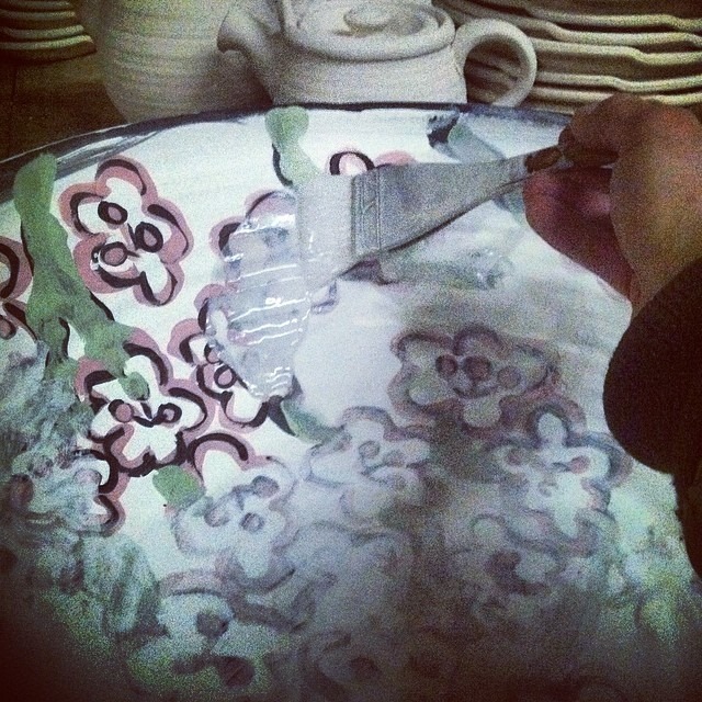
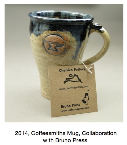
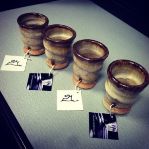
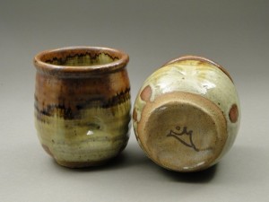
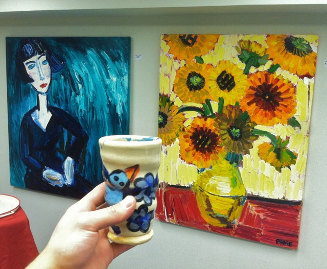
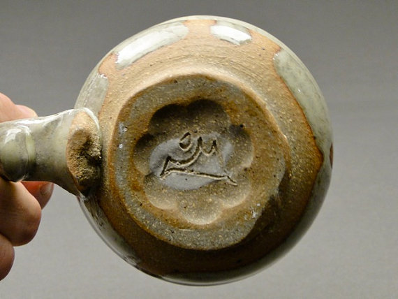
After the images have been edited, they are ready to go online.  When I list Joel’s pots on his online store or his Etsy page, I try to demonstrate the individuality of his work in any way that I can.  One way is by including a process shot or two with every listing.  By catching a glimpse of his creative process, we hope that viewers will appreciate the time and care that Joel puts into every pot.  Oftentimes I will also include a picture that contains Joel’s signature.  On every pot that Joel produces, he engraves his signature, which is a simple line drawing of mountains that demonstrates how he pulls inspiration from the natural world.

Joel Cherrico Signature

Working long hours in an office is easier said than done. We try to keep things lighthearted with casual conversation and breaks. Here’s an office related video for your to enjoy while taking a break from your work day: