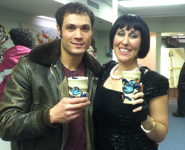
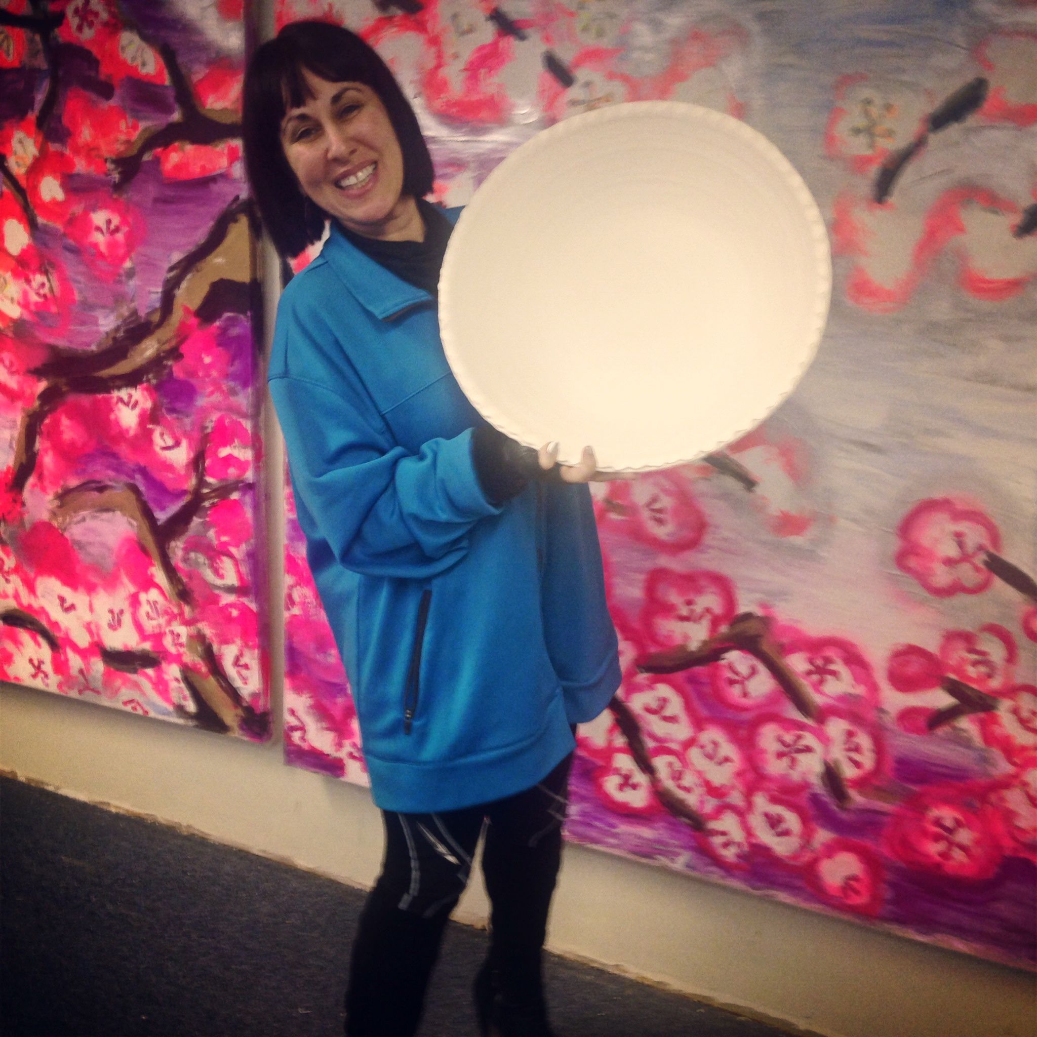
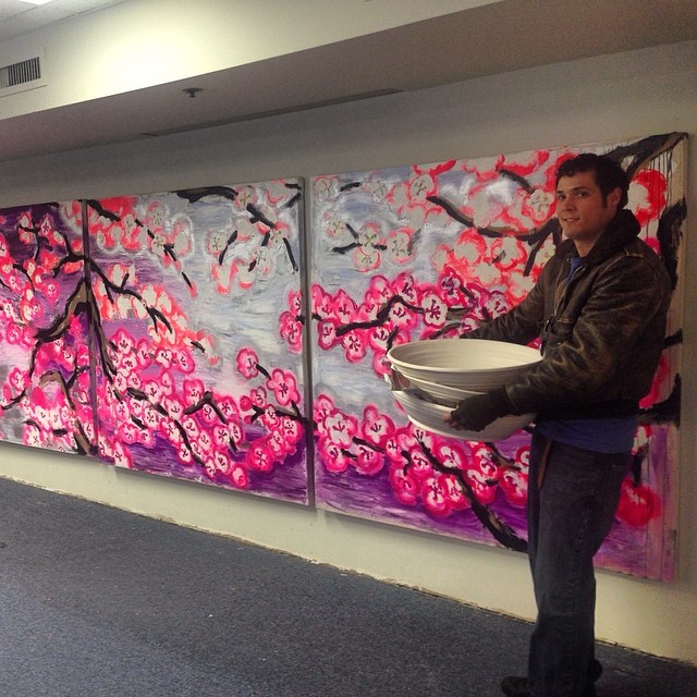
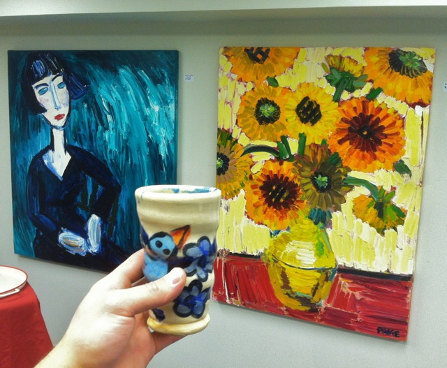
On April 5th, from 6:00-9:00pm, come see Joel’s collaborative painted stoneware on display at Paige Dansinger’s “Cherry Blossoms” gallery exhibition in the Minneapolis Skyway Mall.
Gallery Paige is located at 811 LaSalle Ave in Minneapolis. The space functions as both a gallery and studio for Dansinger. A world-renown painter and digital artist, Dansinger was included in the museum exhibit, Gutai: Spledid Playground, Card Box, at the Solomon R. Guggenheim Museum, NYC. She has also performed her artwork during residencies at the Worcester Art Museum in Massachusetts, the DeCordova Sculpture Park and Museum in Boston and New York’s Brooklyn College.
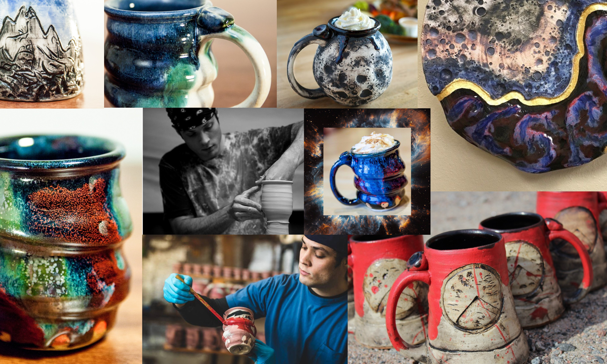
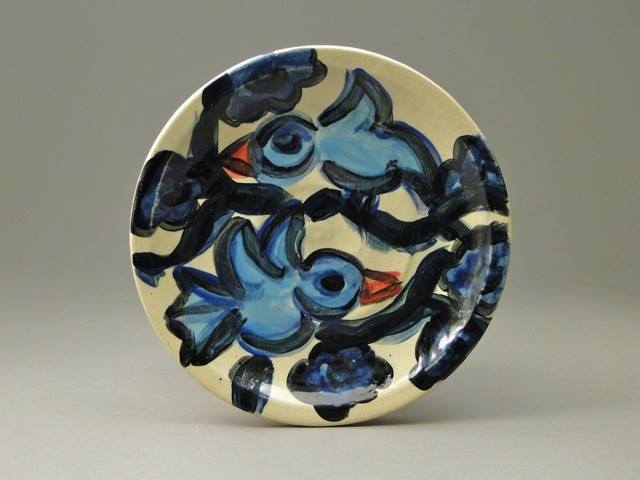
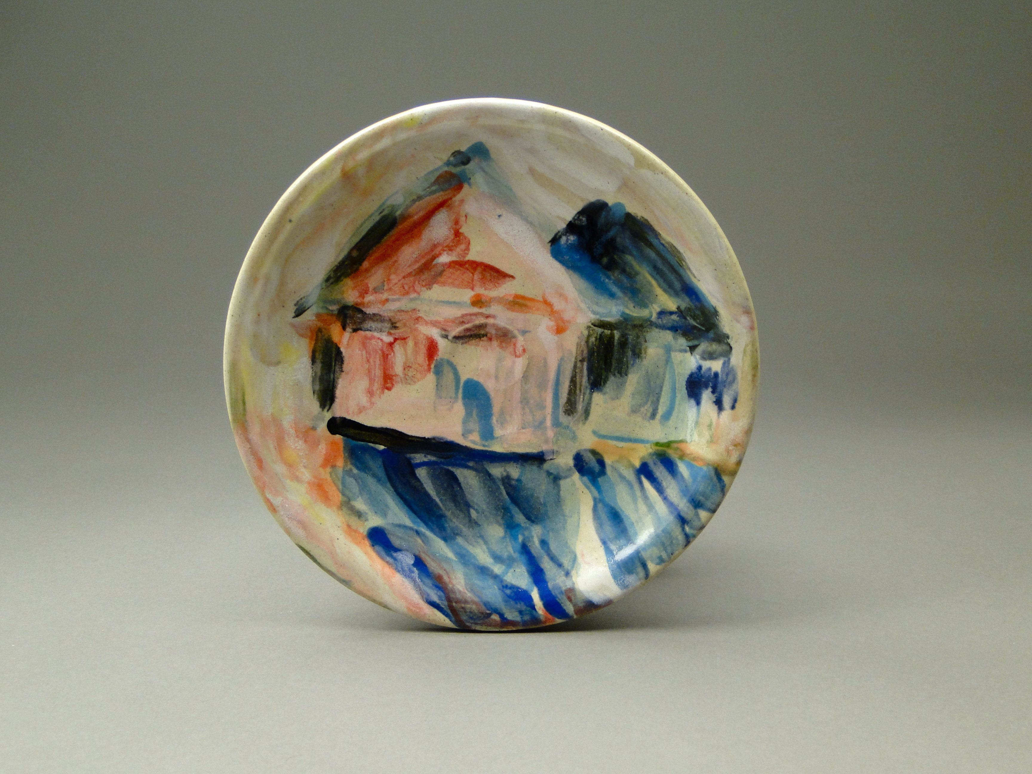
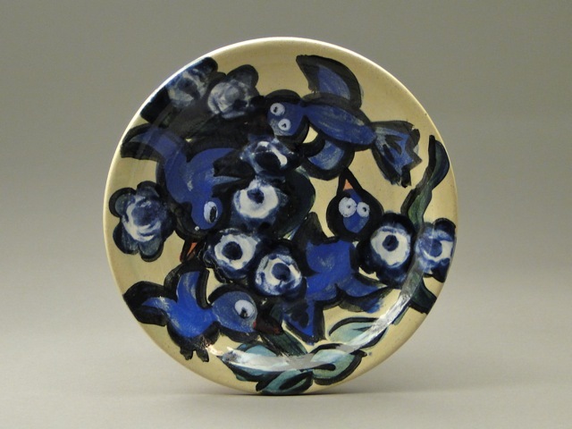
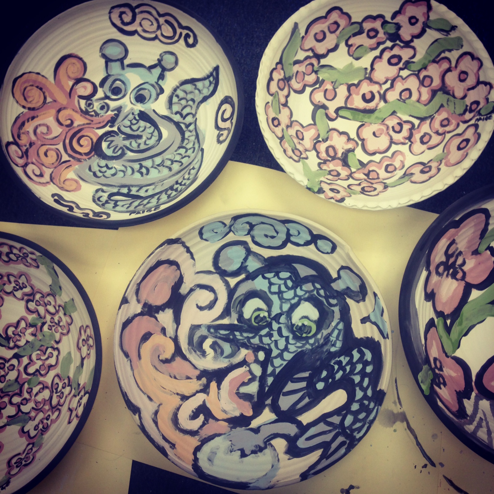
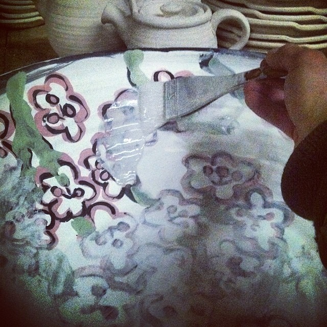
For her current collaboration with Cherrico Pottery, Joel throws clay bowls, platters, and plates for Paige to paint on with glaze materials. He then brings the painted bisqueware to his studio in St. Joseph for firing, and returns the finished pieces to exhibit in Gallery Paige.
Collaborations like these bring Joel’s work in conversation with the larger contemporary art world. His work with Paige not only diversifies his art, but Paige’s paintings come alive on Joel’s 3D pottery surfaces, meant for display and as functional dinnerware. When it comes to the collaboration, Joel says he feels honored to create pottery as canvases for Paige’s iconic paintings.
.
Check out the process shots below to see how these two artists come together to make beautiful works of art:
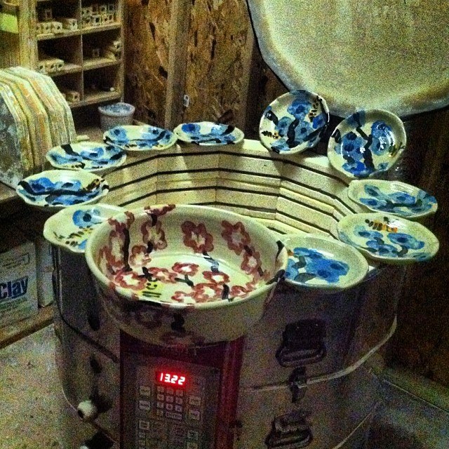
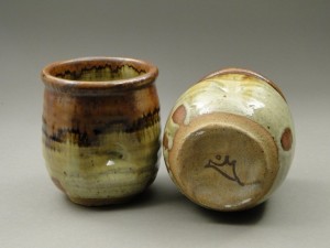
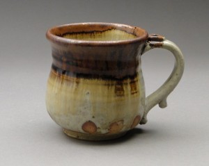
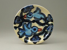
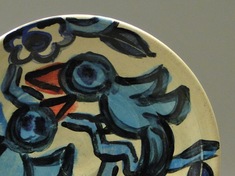
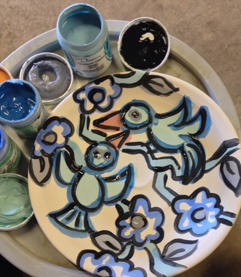
Joel first brings unglazed bisqueware to Paige’s studio for her to paint with glaze materials. Raw clay becomes bisqueware after it’s been fired once.Paige then paints each piece using underglaze materials. Her paintings typically feature a pallet of bright, playful colors and images.After Paige paints each piece with underglazes, Joel brings the painted bisqueware back to his studio and covers it with a coat of clear, glossy glaze. This will give the finished pieces a shiny, smooth surface after firing.At this point, the pieces are ready for 2200 degree firing. Joel uses an electric kiln to fire all his collaborative painted stoneware.
The finished pots will be exhibited April 5th at Gallery Paige in Minneapolis!
Hannah Anderson worked as a “Pottery Marketing Intern” this semester. She is a senior Art major at the College of St. Benedict/St. John’s University. In this post, she describes our semester long task of trying to define the role of pottery in the contemporary art world.
Throughout my internship with Joel, we had many discussions of “high art” vs. “low art” and where his pottery fit into the mix. High art, one could argue, is not functional for the consumer. Traditionally, the function for this type of art is to sit in a museum as a masterpiece, observed through this elevated status. Low art is generally mass-produced, inexpensive, and far more available to the public. In my critical theory class, we discussed how museums have opinions on high and low art as well, and can influence how people view artwork by either appearing intimidating or more approachable.
The terms “high” and “low” art should be reevaluated and adapted to today’s contemporary art world. Words that correlate with high art seem far too Renaissance or Baroque in feel, such as “master of art,” prestige, traditional, western, still-life, landscapes, portraits, and, my favorite, original. This particular word poses the question: can high art even exist anymore? I would argue that it certainly still exists, but not in the same light in which it was originally established. High art and low art should be adaptable terms for each new generation of artists. Low art has synonyms such as: consumerism, production, affordable, advertised, ordinary, etc. This is a challenge many artists face today, and it creates a huge imbalance in the art world.
Joel poses the question, “why are we making and selling pots?” He gathers a lot of insight from potter Warren Mackenzie, whom also has a lot to say about art as a functional vessel vs. sitting in a gallery space. Warren is an 89 year old, world-renowned artist. He is most at ease with his work when he knows it is being used, handled everyday and looked at often. Pottery has the potential to be the most intimate of artwork, because it’s users have constant contact with it. Clay is not expensive and is made from the earth, so when does it make the transition from low to high art?
Price plays a factor into what is high and low art. Warren says “A 10 dollar pot, now that’s affordable.” He says that if it breaks, then it is not a huge loss. This is interesting coming from a renowned artist, because his philosophy conflicts with his position in the art world; his pots resell on Ebay.com for hundreds of dollars everyday. Mackenzie says, “Unfortunately, now I only sell through galleries.” His philosophy seems more focused on low art, but his standing is high.
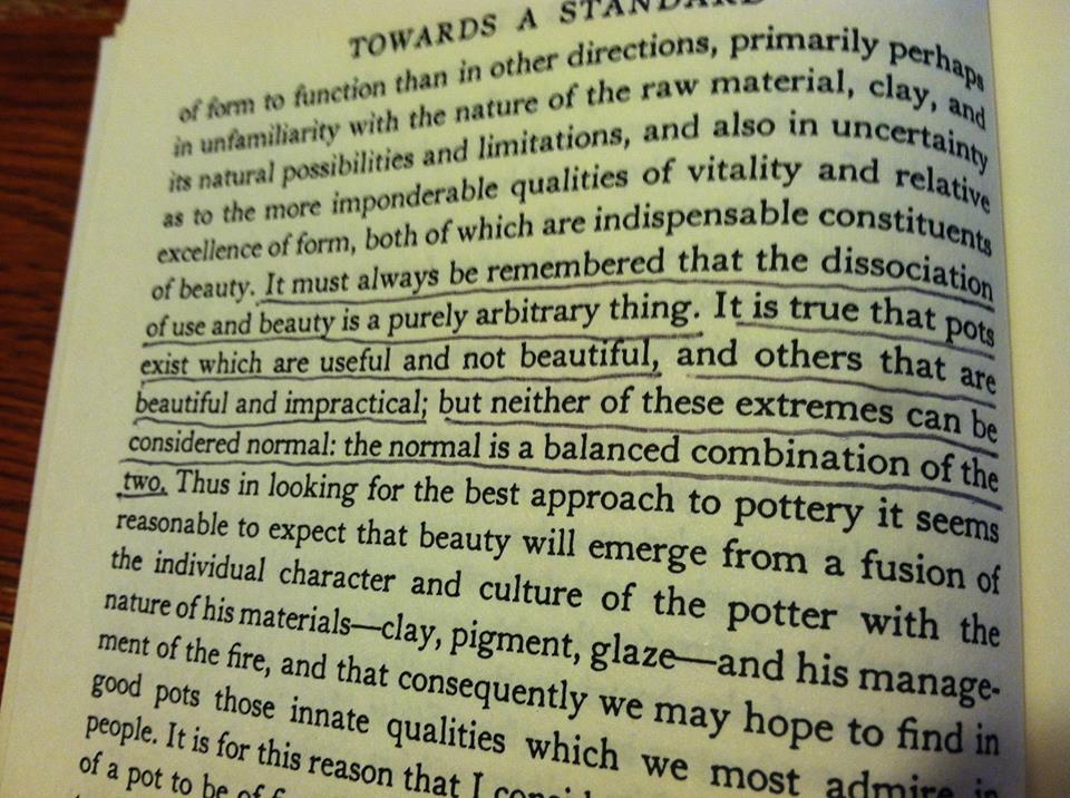
Bernard Leach, “A Potter’s Book” 1940 – Pottery mentor to Warren Mackenzie
I like to think that many artists in today’s art world present a mix of high and low art, and it is perhaps just difficult to find the balance. Right now, an imbalance is evident in Joel’s artwork. His pottery is functional, consumer-friendly, priced lower than most professional potters, and is meant to bring a comfortable aesthetic to anyone’s home. His online store is in contrast with this idea, because we take a high art approach by using professional photography equipment to shoot pots in front of a gradated background. We then use these photos to try and join the contemporary art world.
I wonder, is the Local Blend pottery high or low art? At the Local Blend coffee shop, they use Joel’s pottery in mass, so anyone can eat and drink from his pottery everyday. This seems much closer to low art to me. We take the same pots and put them in front of a gradated background, making them high art in a different atmosphere. Without a little low art, high art wouldn’t be possible, since the Blend is where most of Joel’s income is generated. Writing about this venue has also brought him some of his biggest successes in the art world, including 2 major magazine publications. Perhaps these everyday pots will someday be elevated to a high art status?
Low art is what’s paying the bills, yet in the future, Joel wants to support his livelihood with a balance between low and high art. This means more of his income needs to be generated from our work on the online store. One way we accomplished this was by branding his artwork in a more focused way, using one glaze: the Nuka Glaze with iron. Nuka with iron had a great deal of success for Joel throughout my internship, enough for him to narrow his focus toward solely that glaze. Currently the online store has less Nuka with Iron than Joel would like, and his future plans are to recreate his online store geared toward pottery of only that glaze type. Over 50% of the online sales were Nuka with iron, and Joel sold pots with this glaze type to five different people both locally and nationally in one week. He has also completed 4 dinnerware sets in this glaze, 2 of which were sold through wedding registries. We see huge potential in this glaze combination.
This branding was influenced by Ayumi Horie, who certainly has a recognized, established, successful brand for herself. Her style is easily recognizable on every pot. Her artwork sells at high prices online and is always sold out in less than a day. Moreover, Horie has earned her place in the art world through years of consistent craftsmanship, a huge resume, and skillfully writing about her craft in major publications.
Our experience with high art continued through Paige Dansinger– an internationally renowned painter and art historian who is collaborating with Joel. She makes high art in the form of painting on canvas, digital paintings on IPads, projections, performance, and most recently, painting with glazes on Joel’s pottery. During my internship, she opened a gallery in the Minneapolis Skyway Mall called Gallery Paige. Everyday, she exhibits and sells her artwork as high art. The collaborative work made by herself and Joel has huge potential to take off in the high art world.
To conclude, perhaps in today’s world, the balance needs to be found in the middle of the spectrum between high art and low art. Are the best artists those who spend their time making both high and low art? One could argue that they can reach the most amount of people that way. Because that in fact is what art is all about: reaching the most amount of people with a particular message. The meaning of art and its purpose to be seen can easily get lost when identifying it as either high or low. As renowned potter Bernard Leach said, “To me the greatest thing is to live beauty in our daily life and to crowd every moment with things of beauty. It is then, and then only, that the art of the people as a whole is endowed with its richest significance.”
My most recent gas firing produced some amazing color variations. The kiln was filled top to bottom with pots only glazed in my Copper Red glaze. About half of the pottery had great red colors, ¼ had great red but with color variation, and the remaining ¼ were mostly green, pink or gray. The natural gas flame paints the glaze surface, and potters are blind to this process.
Thanks to my intern Samantha Thury for shooting these images. I many never know exactly how to produce the reddest of reds, but here are some of my guesses:
Bright red/red-orange: consistent reduction and temperature throughout the firing, slower flame path, less oxygen entering the kiln.
Burgundy: heavier reduction. Often gradates to violet, black and then clear. Seen in areas of the kiln where uneven reduction causes flame to become trapped, and then simultaneously over-reduce and oxidize different areas of the same pot.
Gray-Pink: somewhat of a mystery…consistently seen on the left side of this kiln, and in certain other areas of the kiln. The flame could be slower, causing more reduction. Perhaps there is heavier reduction during a certain point in the firing. This color is often seen next to bright red, but rarely seen next to clear. This could mean that reduction is achieved before cone 5, but perhaps too much reduction is achieved.
Gray: transition color mostly seen from bright red/burgundy to clear, but seen here on a more red/pink to clear transition.
Clear: oxidized. The bottom shelf of most kilns usually results in clear, sometimes with hints of red or violet. Achieving medium reduction before cone 5 and through cone 10 could eliminate clear. I also see clear closest to the burner ports and target bricks, where the flame path is faster and more turbulent.
For all you potters interested in producing your own Copper Red glazes, check my previous blog post for my glaze recipes and firing techniques:
I’ve been exploring Copper Red glaze recipes for about 2 years now, and I still don’t know exactly what causes the reddest of red glazes. Some recipes are consistently dull liver color, yet they will blush orange-red from time to time, like the mug pictured to the left. It was in a firing that did not have enough reduction. A lot of the pottery was mostly green, like the right side of this mug. For some reason this pot has an awesome red-orange racing stripe down the side right where the green transitions to red. Was it because the flame was hitting it in a weird way? It wasn’t even close to the burner ports….
“Copper Red Glazes” by Robert Tichane is the best resource I’ve found for Copper Reds. If you want to learn about reds I say read it, then read it again. He suggested that any base glaze can be adapted to a Copper Red glaze by adding 2% Copper Carbonate and 3% Tin Oxide and then firing in a reduction atmosphere. This inspired the above glaze, which was originally an Elaine Coleman Celadon that I found in an old Ceramics Monthly. I added the Copper and Tin, as well as a bit of EPK to raise it from cone 9 to cone 10. Here’s the recipe, and don’t forget to glaze very thick!!
Copper Red/Elaine Coleman Celadon
Whiting
21.0
Custer Feldspar
25.0
EPK Kaolin
20.0
Silica (325-mesh)
25.0
Ferro Frit 3134
8.8
Zinc Oxide
2.7
Tin
3.0
Copper Carbonate
2.0
Bentonite
2.0
Talc
2.0
Total:
111.5
Another book that’s super helpful for Copper Reds, and just about every other glaze at Cone 9-10 is “The Complete Guide to High-Fire Glazes: Glazing and Firing at Cone 10” by John Britt. Buy this book, seriously. I learned most of what I know about glazing from this book. John also describes a bunch of his techniques all over Youtube, here’s a great one for glaze testing:
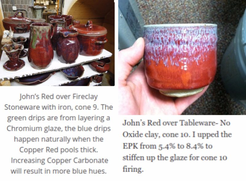
The images below show the “John’s Red” glaze on stoneware. It’s also important to note that John’s Red glaze is much more vibrant than the above glaze (Copper Red/Elaine Coleman Celadon), which is often liver colored, or muddy brownish red. I wonder why???
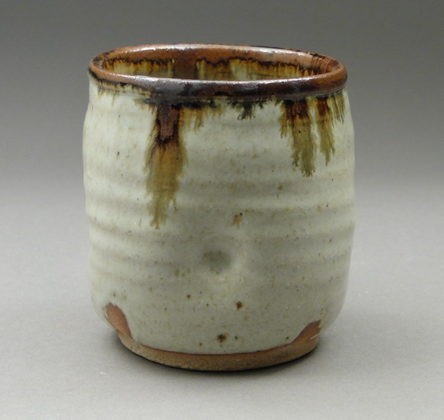
The left image shows John’s Red at cone 9 over Fireclay Stoneware with iron. I really like these dark burgundy reds, but recently I’ve switched to “Tableware- No Oxide” clay from Continental Clay, which is a white stoneware with very low iron content. It helps brighten up the reds, like the cup shown on the right. The rim was also dipped in a Nuka glaze, which ran down the pot during the firing.
Here’s the recipe I’m working with. It’s John’s Red, but I increased the EPK from 5.4% to 8.4% to stiffen up the glaze for cone 10 firing:
John Britt Red, cone 10
Custer Feldspar
96.4
Whiting
27.2
Silica (325 mesh Flint)
31
EPK
18
Frit 3134
18.2
Talc
7.2
Zinc Oxide
9
Tin Oxide
2.4
Copper Carbonate
1.9
Bentonite
2
Total
213.3
Nuka is an ash glaze. Check out “Ash Glazes” by Phil Rogers for some great recipes and info on ashes. Nuka’s are so awesome that they deserve an entirely different blog post, so I’ll just give you the rundown on the recipe I’ve developed over about 2 years. I get wood ashes from a friend with a wood stove and dry sift them through 12 mesh, then again through 40 mesh. The glaze recipe changes with the type of wood ash and the sifting process, but here is my current cone 10 recipe…although it’s likely to change because right now it looks a lot better at cone 11:
Nuka, 4/23/12
Wood Ash
33
Custer Feldspar
50
Silica (325 mesh Flint)
30
Whiting
20
Bone Ash
20
Bentonite
10
total
163
Firing is another crucial component to Copper Reds. Currently I fire in a large natural gas kiln with about 30 cubic feet of stackable space in about 10-11 hours. I essentially use John Britt’s Reduction 1 firing cycle with a few tweaks. I fire oxidation until cone 010 drops (about 1700 degrees F) and then do 30 minutes of heavy reduction- the kiln usually stalls in temp. Then, I fire in mild to medium reduction until cone 10 is very soft. I’d say more reduction is better than less here. I’ve yet to see adverse effects from over-reducing but I have gotten green from under-reducing. Lastly, I open the damper and put the kiln into straight oxidation for 30 minutes, until cone 10 drops and 11 is soft- then shut down with the damper closed. Robert Tichane writes about the importance of peak temp. oxidation for bright reds, and I’ve seen great results with this technique.
Now go mix up some glaze and start chasing the red!