Ogres, Princesses, and Pretty Blue Glazes

I remember the first time glazing a pot in Sam Johnson’s ceramics class last year. I had made this slightly uneven coil vase with pockmarked walls nearly an inch thick. The piece was truly ugly, an ogre really, but I couldn’t see the pot as anything other than beautiful. It was my Princess Fiona and I was its Shrek…At least until I glazed it.

Like most naive ceramics students, I pictured glazing just like painting. I picked out a handful of colors using the test tiles as my guide, and then brushed swooping glaze patterns all over my vase. By the time I finished, the pot looked like something straight out a kindergarten arts and crafts class. I on the other hand thought it was a masterpiece – a trophy of abstract art. When the thing (it was beyond a pot at this point) finally came out of the kiln, it was hideous. I looked over at my professor for encouragement. Sam walked over, took one look at my monster, turned to the class and said:

“Opening a kiln can be like Christmas or Halloween. Either the pots look amazing and you fall in love, or the results are horrible and you want to smash everything.”

Kiln Loading 2
The moment of truth, loading a kiln of glazed pots.

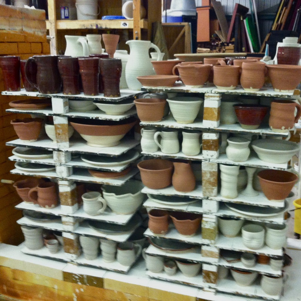
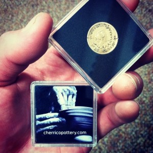
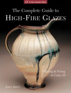
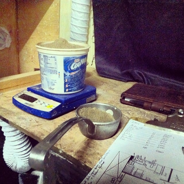
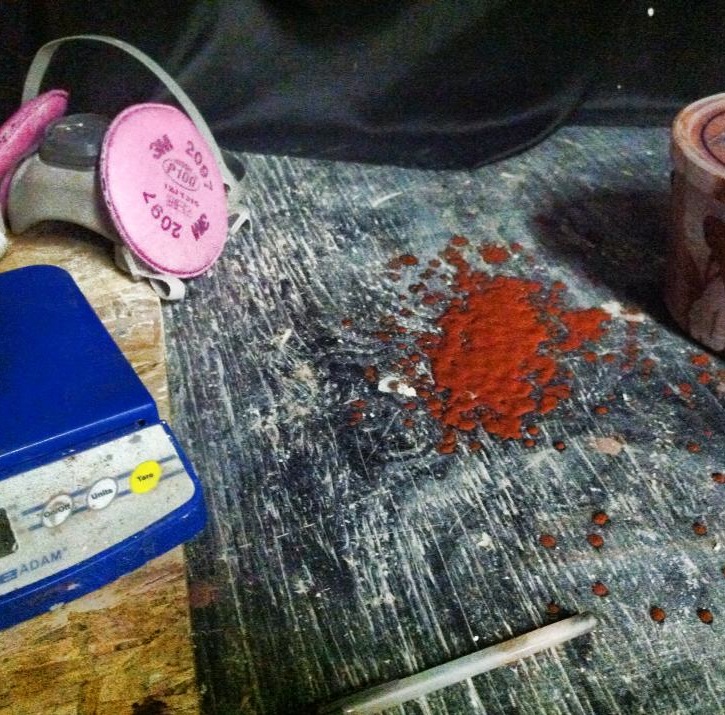
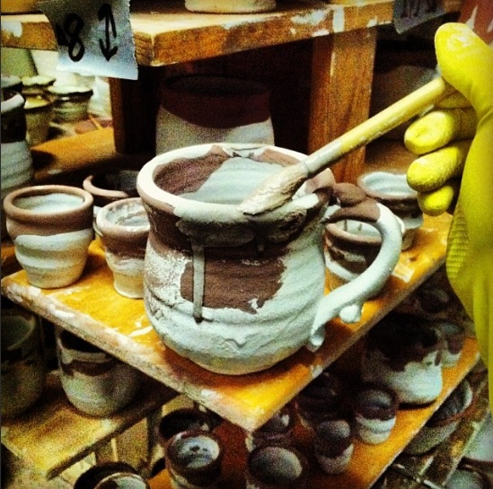
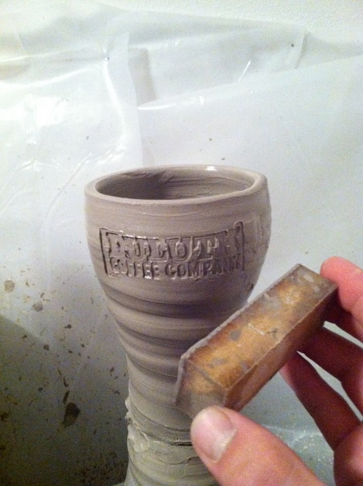
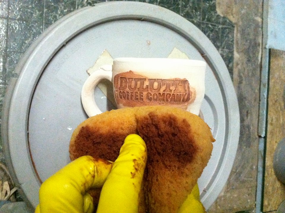
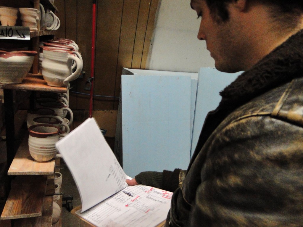
Unlike my great clay ogre, Joel can’t afford to make ugly pots. He makes his living through pottery, and as a result, his experiments with glaze need to be calculated and precise. He needs to know exactly how each part of the glaze works; how copper, cobalt, and iron make red, blue, and rust colors when the glaze reacts with fire in the kiln. Glazes transform clay bodies from ogres into princesses. However, as Joel continues to explore glaze chemistry, he finds that these potions are often difficult to create. Like the alchemists I wrote about last post, Joel works tirelessly to find the right balance of form and color that’ll turn a clay body into a beautiful work of art. For his livelihood, each glaze must reach for a certain standard of beauty.

Glaze Notes
– Studying past glaze recipes, tweaking the ingredients to make more alluring pots.

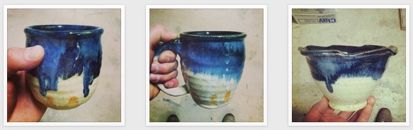
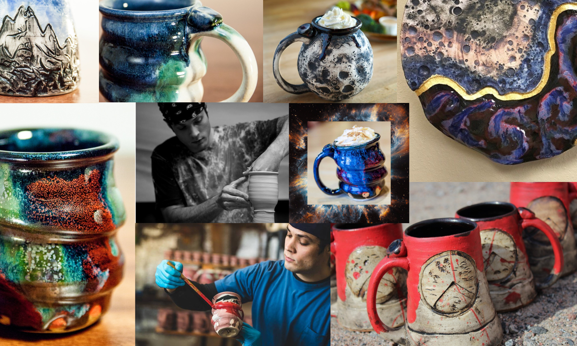
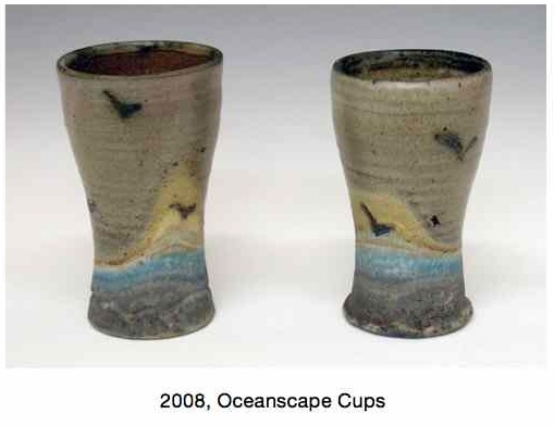
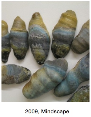
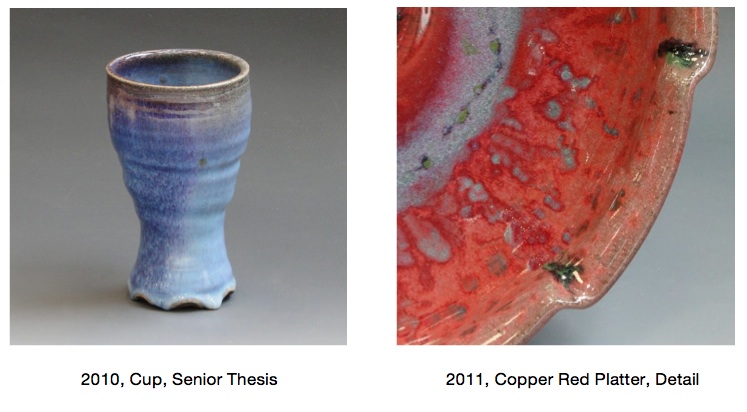
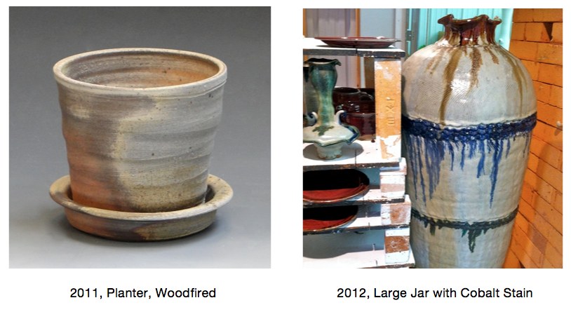
Looking back at his previous body of work, I think Joel’s been chasing this certain type of beauty all along. It’s been hidden in his work throughout the years, and now I feel we’re just starting to uncover it in the color blue.

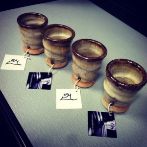
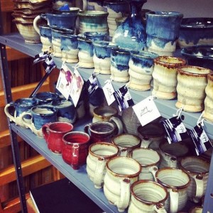
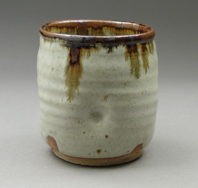
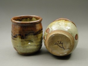
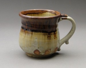
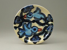
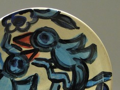
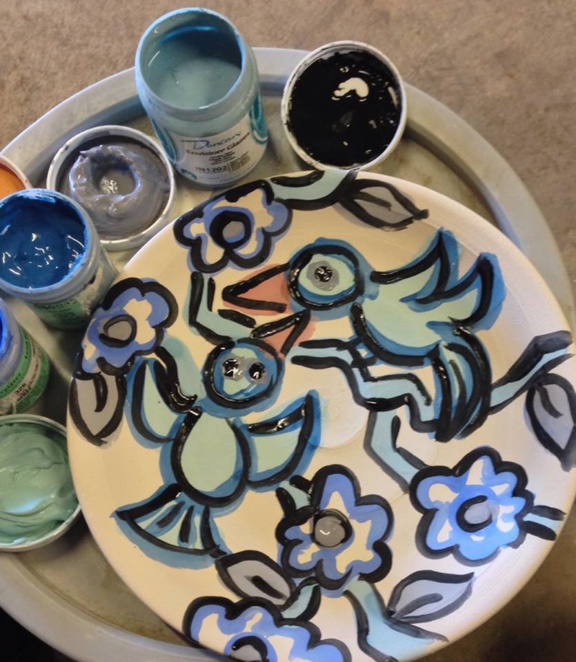
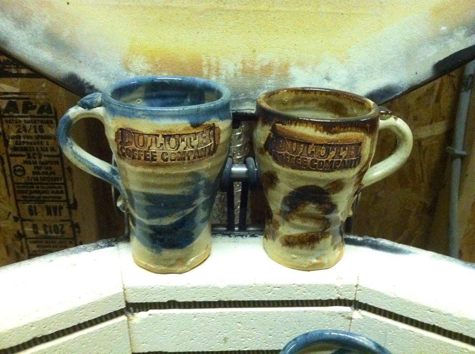
Take a look at the gallery below to see an evolution of this blue color. Even in woodfiring, salt firing and copper red glazes, the color blue shows up. I can track the color throughout his work back to 2008:

2008, Oceanscape Cups    2009, Mindscape

Copper Red Glazes, Salt and REduction Fired, Joel Cherrico Pottery

2011 planter and jar, Cherrico Pottery

Paige Dansinger Collaboration  Collaboration with Bruno Press

Numerous potters talk about the lore of blue pottery. Throughout the ages, potters can’t seem to shy away from it. I’ve heard some contemporary potters even refer to the color as cash-flow blue.

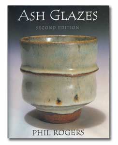
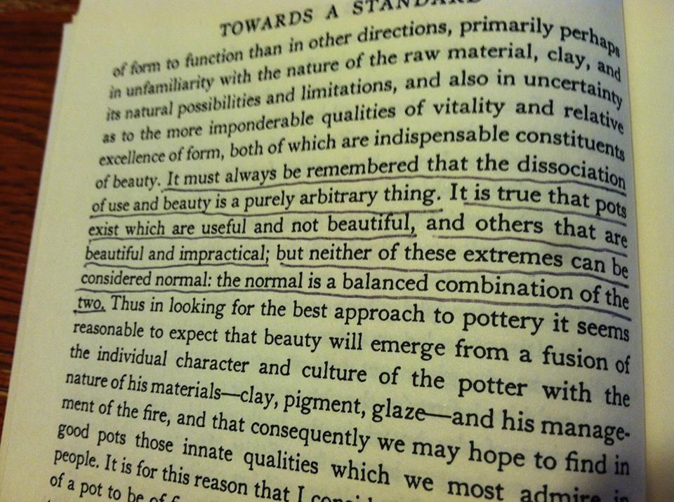
Our text book this semester has been Bernard Leach’s A Potter’s Book. Now a 50 year old text, Leach provides a rich history of how ceramics has evolved. His book not only offers rich lessons of the past, but it also gives insights into the future. But even Leach, who wrote the book after decades of experience under his belt, could not seem to understand the lure of the color blue in ceramics. These stories share his experiences with blue glazes:

“At my St. Ives workshop each summer we are asked by three visitors out of four for colour and yet more colour, blue and the more intense the better, is easily the favourite.”

– A Potter’s Book, page 36

“Yesterday we had a good bunch of people, 2 of whom at least knew a good pot when they saw it. One woman started by asking if we hadn’t got any ‘blue pots’, and when David showed them that the last olive-blue glaze for which we have experimented for years, she said: ‘Oh! Do you call that blue?'”

A Potter’s Book, page 227-228

Perhaps what this all boils down to is something we talked about in the beginning -the pursuit of beauty. Some of the best potters in the contemporary art world don’t make beautiful work. Their work is strange, ugly and confusing.

Poster, NCECA, Joel Cherrico Pottery, Handmade Ceramic Pottery, 2014
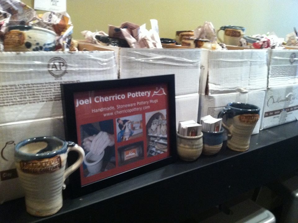
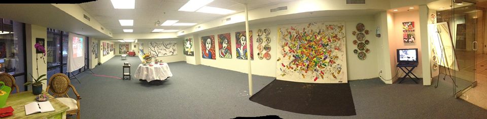
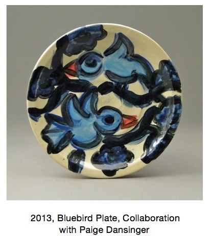
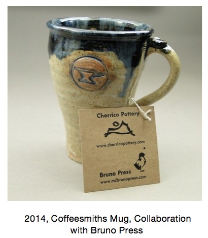
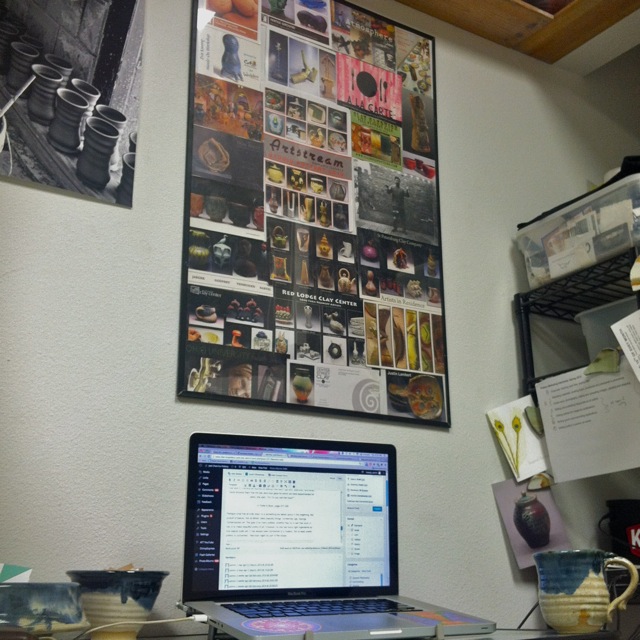
With this in mind, does the color blue still have a place in the contemporary ceramic world? This poster sits above our workspace, and it’s made from postcards Joel picked up in Philadelphia in 2010 at NCECA (National Council for Education for the Ceramic Arts). It gives a snapshot of the contemporary ceramic work, and shows only a handful of simple, blue pots. Joel will be at the conference in Milwaukee next week networking with contemporary potters and pottery enthusiasts. His goal is to show that the color blue continues to have a strong lure in both historical pottery as well as contemporary ceramics. He wants his work to be a bridge between historical potters like Leach and contemporary artists like Paige Dansinger. As a result, we’ve prepared some innovative market ideas, re-designed the website home page, and packed the online store with blue pots and artist collaborations with Dansinger. We’re prepared for the biggest ceramics conference in the country and we’re hoping to lure people to us with our blue pots!

Joel Cherrico Pottery Marketing Ideas, 2014  Joel Cherrico Pottery Business Card Coins

Joel Cherrico Pottery, Shot Cups, Innovative Marketing   Joel Cherrico Pottery, Shot Cups and Mugs, Innovative Marketing

Bernard Leach, A Potters Book, Beautiful Pottery, Joel Cherrico Pottery, 2014
Bernard Leach, “A Potter’s Book” (Page 7)

Glaze Chemistry and Alchemy

Pottery Alchemy, Alchemy Definition, Joel Cherrico Pottery, 2013

The New World Dictionary, Copyright 1967

In many ways, the work of the modern potter mirrors the work of the ancient alchemist. Potters blend earthly materials like clay, stone, and ash, into complicated glaze mixtures. Then through fire, these base substances transform into precious works of art. With glaze chemistry, and one part modern alchemy, potters turn the natural elements we once took for granted into the treasured artifacts we display in our homes and galleries.

It’s interesting to see how much the glazing, alchemy, and human life relate to each other. Bernard Leach, author of A Potter’s Book, helps us understand glazes by relating them to the body. He says most glazes have 3 main parts -the blood, bone, and flesh. Here’s how they work:

1.) Fluxing agent  or “life blood of the glaze” – causes the glaze materials to melt and flow together in the kiln firing.

2.) Refractory or “bone of the glaze”  resists heat and melting, providing structure and strength to the glaze body.

3.) Glass Former or “flesh of the glaze”  creates complexity, depth and unique qualities.

(page 133-134)

Similar to Bernard Leach, the early alchemists fused their chemical efforts with the body. Calling their experiments the Magnum Opus, or “Great Work,” these men searched tirelessly for the right chemical concoctions that would enrich life or prevent death. In some ways, full-time potters do the same through glaze chemistry. They are constantly searching for that perfect potion that will immortalize a clay body and turn sand, water, and ash into gold.

These 2 books, by potters John Britt and Phil Rogers, gave Joel the necessary skills to develop that perfect glaze surface, but like the early alchemists, he’s still searching.

Ash Glazes, Phil Rogers, Joel Cherrico Pottery, 2014    John Birtt the complete guide to high-fire glazes, Stoneware Pottery

Like alchemy, glazing is often a fiery, messy, and sometimes toxic process. The kiln releases CO2, the powdered glaze materials are dangerous inhalants, and the heavy metal colorants cause skin irritation. Joel mixes all his glazing in an old boat shed. This dirty, dark laboratory gives him 24 hour access to glaze experimentation, providing the perfect amount of chaos to create beautiful works.

Pottery Alchemy, Joel Cherrico Pottery, Glaze Mixing, Cone 10 Stoneware, 2014  Joel Cherrico Pottery, Pottery Alchemy, Glaze Mixing, 2013 Pottery Alchemy, Glaze Layering, Joel Cherrico Pottery, 2014  Pottery Alchemy, Joel Cherrico Pottery, Skutt Electric Kiln, 2014

Joel’s pottery has to be strong enough to be used in a coffee shop everyday. The Local Blend Baristas say they wash a mug up to 5 times per day, 7 days per week! With this in mind, Joel adapted the Nuka glaze to suit the stress. Traditionally a simple 3-ingredient mixture, Joel added more chemicals to strengthen the glaze surface, reducing flaws like pinholes and crazing while increasing durability and gloss. Here’s the recipe for all the curious potters out there:

Joel Cherrico Nuka Glaze, Cone 10 Recipe, 2014

Some potters spend their careers trying to find the right glaze mixtures. In next Friday’s post, we’ll delve into some of these mixtures more and explore the lure of pretty blue pottery.

Cobalt-based glazes, or what some potters call “cash-flow” blue glazes, have been mystifying both potters and customers for decades.

“At my St. Ives workshop each summer we are asked by three visitors out of four for colour and yet more colour, blue and the more intense the better, is easily the favourite.”

A Potter’s Book, Bernard Leach, page 36

Finding a Balance in an Imbalanced Art World

Hannah Anderson worked as a “Pottery Marketing Intern” this semester. She is a senior Art major at the College of St. Benedict/St. John’s University. In this post, she describes our semester long task of trying to define the role of pottery in the contemporary art world. 

Guest Posting by Hannah Anderson (view her Linkedin page here)

Throughout my internship with Joel, we had many discussions of “high art” vs. “low art” and where his pottery fit into the mix. High art, one could argue, is not functional for the consumer. Traditionally, the function for this type of art is to sit in a museum as a masterpiece, observed through this elevated status.  Low art is generally mass-produced, inexpensive, and far more available to the public. In my critical theory class, we discussed how museums have opinions on high and low art as well, and can influence how people view artwork by either appearing intimidating or more approachable.  

The terms “high” and “low” art should be reevaluated and adapted to today’s contemporary art world. Words that correlate with high art seem far too Renaissance or Baroque in feel, such as “master of art,” prestige, traditional, western, still-life, landscapes, portraits, and, my favorite, original.  This particular word poses the question: can high art even exist anymore?  I would argue that it certainly still exists, but not in the same light in which it was originally established.  High art and low art should be adaptable terms for each new generation of artists. Low art has synonyms such as: consumerism, production, affordable, advertised, ordinary, etc.  This is a challenge many artists face today, and it creates a huge imbalance in the art world. 

Joel poses the question, “why are we making and selling pots?” He gathers a lot of insight from potter Warren Mackenzie, whom also has a lot to say about art as a functional vessel vs. sitting in a gallery space. Warren is an 89 year old, world-renowned artist. He is most at ease with his work when he knows it is being used, handled everyday and looked at often. Pottery has the potential to be the most intimate of artwork, because it’s users have constant contact with it.  Clay is not expensive and is made from the earth, so when does it make the transition from low to high art?

Price plays a factor into what is high and low art.  Warren says “A 10 dollar pot, now that’s affordable.”  He says that if it breaks, then it is not a huge loss.  This is interesting coming from a renowned artist, because his philosophy conflicts with his position in the art world; his pots resell on Ebay.com for hundreds of dollars everyday. Mackenzie says, “Unfortunately, now I only sell through galleries.” His philosophy seems more focused on low art, but his standing is high.

Bernard Leach, A Potter's Book, 1940, Joel Cherrico Pottery
Bernard Leach, “A Potter’s Book” 1940 – Pottery mentor to Warren Mackenzie

I like to think that many artists in today’s art world present a mix of high and low art, and it is perhaps just difficult to find the balance.  Right now, an imbalance is evident in Joel’s artwork. His pottery is functional, consumer-friendly, priced lower than most professional potters, and is meant to bring a comfortable aesthetic to anyone’s home. His online store is in contrast with this idea, because we take a high art approach by using professional photography equipment to shoot pots in front of a gradated background. We then use these photos to try and join the contemporary art world.

I wonder, is the Local Blend pottery high or low art? At the Local Blend coffee shop, they use Joel’s pottery in mass, so anyone can eat and drink from his pottery everyday. This seems much closer to low art to me. We take the same pots and put them in front of a gradated background, making them high art in a different atmosphere.  Without a little low art, high art wouldn’t be possible, since the Blend is where most of Joel’s income is generated. Writing about this venue has also brought him some of his biggest successes in the art world, including 2 major magazine publications. Perhaps these everyday pots will someday be elevated to a high art status?

Low art is what’s paying the bills, yet in the future, Joel wants to support his livelihood with a balance between low and high art. This means more of his income needs to be generated from our work on the online store. One way we accomplished this was by branding his artwork in a more focused way, using one glaze: the Nuka Glaze with iron. Nuka with iron had a great deal of success for Joel throughout my internship, enough for him to narrow his focus toward solely that glaze. Currently the online store has less Nuka with Iron than Joel would like, and his future plans are to recreate his online store geared toward pottery of only that glaze type.  Over 50% of the online sales were Nuka with iron, and Joel sold pots with this glaze type to five different people both locally and nationally in one week. He has also completed 4 dinnerware sets in this glaze, 2 of which were sold through wedding registries. We see huge potential in this glaze combination.

IronDippedWineCups, SKU#326, Image 2

Nuka Glaze with Iron, Joel Cherrico Pottery, 2013 Nuka Glaze with Iron Stoneware Mug, Joel Cherrico Pottery, 2013

This branding was influenced by Ayumi Horie, who certainly has a recognized, established, successful brand for herself. Her style is easily recognizable on every pot. Her artwork sells at high prices online and is always sold out in less than a day. Moreover, Horie has earned her place in the art world through years of consistent craftsmanship, a huge resume, and skillfully writing about her craft in major publications.

Our experience with high art continued through Paige Dansinger– an internationally renowned painter and art historian who is collaborating with Joel. She makes high art in the form of painting on canvas, digital paintings on IPads, projections, performance, and most recently, painting with glazes on Joel’s pottery. During my internship, she opened a gallery in the Minneapolis Skyway Mall called Gallery Paige. Everyday, she exhibits and sells her artwork as high art. The collaborative work made by herself and Joel has huge potential to take off in the high art world.

BlogPostImage1  Handmade_Painted_Plates_Paige_Dansinger_and_Joel_Cherrico_Artist_Collaboration_SKU_317_Image_1__50351.1381113981.235.275Paige Dansinger Painting on Plates, Joel Cherrico Pottery, Handmade Ceramic Painted Plates

Paige-Dansinger-Paintings-Joel-Cherrico-Artist-Tableware-2013-Gallery-Paige-Van-Gogh

To conclude, perhaps in today’s world, the balance needs to be found in the middle of the spectrum between high art and low art.  Are the best artists those who spend their time making both high and low art? One could argue that they can reach the most amount of people that way.  Because that in fact is what art is all about: reaching the most amount of people with a particular message. The meaning of art and its purpose to be seen can easily get lost when identifying it as either high or low.  As renowned potter Bernard Leach said, “To me the greatest thing is to live beauty in our daily life and to crowd every moment with things of beauty. It is then, and then only, that the art of the people as a whole is endowed with its richest significance.”

Pottery Business Trip: Stamped Mugs for Duluth Coffee Company, Artist Dinnerware for Gallery Paige

“When asked about his chief concern as an artist and potter, he modestly replied, ‘I honestly do not know. I respond to something inside me and I do not know what I am doing until I have done it. The moment of completion is sharing with others. The work is from myself but not for myself.’”

–       Jonathan L. Fairbanks, about Brother Thomas, October 2007, from “Remembering Brother Thomas Bezanson,” Pucker Gallery, Boston.

The moment of completion is an exciting part of the pottery process. My old college professor, Sam Johnson, used to say that unloading glaze kilns was like Christmas or Halloween. Either the pots turn out great and cause an adrenaline rush of excitement, or ugly, flawed glazes send you plunging into a pit of despair.

When good pots do come out of the kiln, the artistic process continues to the viewer or user of those pots. Brother Thomas created forms and surfaces with inherent beauty, and he knew that this beauty needed to be shared. His work is exhibited in museums and galleries across the world. Sharing artwork lets artists grow by collecting feedback from viewers. Potters generally do this in 2 ways: exhibition and sales.

I see a lot of common ground between good kiln openings, selling pots, and exhibiting art. They involve the culmination of hard work and reaping rewards. The experiences happen quickly and often bring good vibes that linger for hours. Last Friday, I shared three of these experiences in one, epic day. It’s also worth mentioning 381 miles of travel, which comes to $215 in tax deductions at $.565 per mile according to www.irs.gov.

8:00am Kiln Opening

I opened the Skutt kiln and pulled out about 70 mugs for Duluth Coffee Company, made with a hand carved stamp by Bruno Press. I spent an hour polishing the bottoms of 100 total mugs, packaged them in 5 clay boxes and loaded the car. After a morning of errands, I drove from St. Joseph to Duluth.

Process Shot 2, Duluth Coffee Co

2:00pm Duluth Coffee Company Drop-off

Eric Faust, owner and roaster, met me with an awesome cup of fresh roasted coffee and a check. This was an order for re-sale, and it could revolutionize how I make new bodies of work for coffee shops. Last year, Eric worked with a potter that sold about 400 stamped mugs through his shop. The potter moved out of state and Eric has been searching for a potter to rejuvenate this project. I was lucky enough to meet him months ago, when visiting friends in Duluth and scouting coffee shops. I was even luckier when he offered to buy the mugs wholesale- the first time this has happen in my 3.5 years as a full-time potter.

Eric generously let me retain artistic freedom. Too often I have received requests for stamps, carvings, or colors that fall outside my aesthetic interests or capabilities. This project reflects Duluth Coffee Company’s philosophies about roasting and brewing signature, gourmet coffees for the local community.

Process Shot 3, Duluth Coffee Co Process Shot 1, Duluth Coffee Co

DuluthCoffeeMug3, Image 1  DuluthCoffeeMug2, Image 1 Duluth Coffee Company, Joel Cherrico Pottery Stamped Mugs, 2013 Stoneware Mugs Duluth Coffee Company, Joel Cherrico Pottery Stamped Mugs, 2013

8:00pm: Gallery Paige, Grand Opening

Paige Dansinger is a renowned painter and art historian who has exhibited internationally, including a show at the Guggenheim this past spring. We met coincidentally at Continental Clay supplier while she was buying machine-made plates and glazes to paint for a commission. I said, “It would be great if a potter could make plates for you” and she replied, “Well, do you make plates?” Also coincidentally, I was at Up Cafe performing pottery throwing demos, that day only. She saw me throw, saw the stack of 500+ pots in their space, and we caught the vibe that we need to team up.

In the 2 months I’ve known Paige, she’s come to my kiln space to paint on my pots, invited me to her studio to view her process and bring more pots, and opened a gallery. That’s right, she opened a gallery in the downtown Minneapolis Skyway mall!

Gallery Paige had the Grand Opening Friday. Dozens of her pieces graced the gallery walls as paint on canvas, painted plates, and her innovative #DrawArt displayed as video and projection. Artists and art collectors streamed in and out of the space for hours. I brought her the first 2 glazed, finished pots from our collaboration and we shared a toast to the next body of work! Her paintings are gorgeous and I feel honored to begin the process of making pots as canvases for such a renowned artist.

When I met Paige she said, “I want my paintings in museums all over the world, hanging next to Picasso.” I think she’s on track to live into that goal!

Paige Dansinger Paintings, Joel Cherrico, Artist Tableware, 2013, Gallery Paige, Van Gogh  Paige Dansinger Paintings, Joel Cherrico, Artist Tableware, 2013, Gallery Paige

Gallery Paige, Photo by Paige Dansinger, 2013

Photo by Paige DansingerPhoto by Artist Jim Mcallister, Gallery Paige, Joel Cherrico Pottery, 2013

Photo by video artist Jim Mcallister. View some of our collaborative work here:

https://www.cherricopottery.com/video/

New Pots at Up Cafe: Customers Using Handmade Pottery Everyday

Over the month of December I busted out about 550 new pieces of pottery for use as serving vessels in Up Cafe– a new coffee shop in northeast Minneapolis! This new coffee shop is attached to Upper Midwest Gourmet and Flamenco Organic Coffee Roastry. They’re open for business, so you can stop by anytime and sip an artfully mixed coffee drink from one of my mugs. Check out this spread in Minnesota Monthly about their “soft opening”

http://www.minnesotamonthly.com/media/Blogs/Twin-Cities-Taste/February-2013/Shhh-Its-a-Quiet-Opening-at-Up-Cafe/index.php

Below are a few images of my pottery in their space. Watch for future posts of higher quality images and information about their grand opening. Also, special thanks goes out to my cousin Michael Applen for his Entrepreneurial mindset. He always pushed me to come up with new ways to get my pottery out into the world. He was an important part of getting pottery into Up Cafe, as well as getting this coffee shop open for business. Thanks for your help cous!

Also thanks to Central Minnesota Arts Board for awarding me a $3,000 grant that helped make this possible!

www.centralmnartsboard.org

[wppa type=”slideonly” album=”9″][/wppa]