About three weeks ago, Joel traveled to Milwaukee, Wisconsin to attend NCECA 2014. The national ceramics conference brought together potters and pottery enthusiasts from across the country to celebrate all things clay. One of the greatest takeaways from the conference for Joel was when he met Carole Epp, writer of the popular ceramics blog Musing About Mud. The two hit it off immediately, and Carol invited him to write an emerging artist’s post for her blog.
Here’s a link the article Joel wrote. The post describes what NCECA was like for Joel as an emerging potter and what he learned from the contemporary ceramics community.
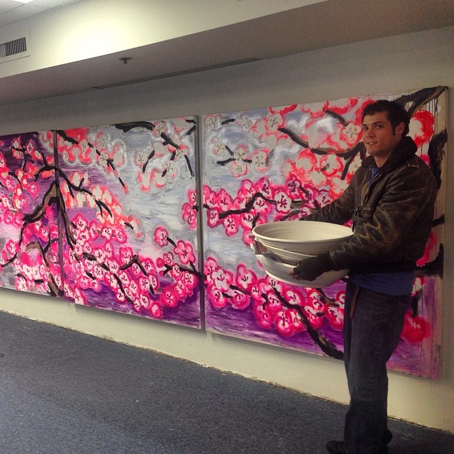
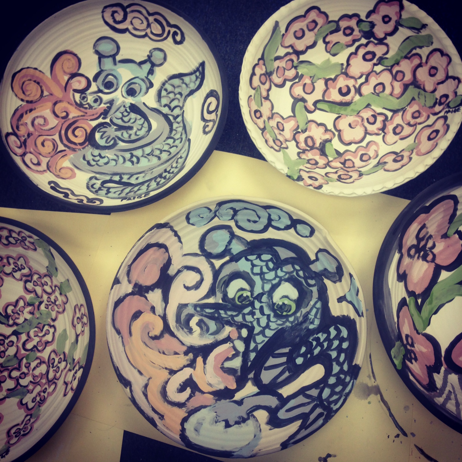
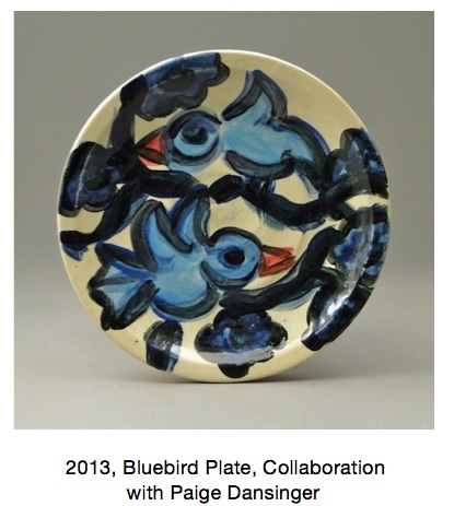
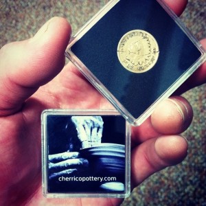
On April 5th, from 6:00-9:00pm, come see Joel’s collaborative painted stoneware on display at Paige Dansinger’s “Cherry Blossoms” gallery exhibition in the Minneapolis Skyway Mall.
Gallery Paige is located at 811 LaSalle Ave in Minneapolis. The space functions as both a gallery and studio for Dansinger. A world-renown painter and digital artist, Dansinger was included in the museum exhibit, Gutai: Spledid Playground, Card Box, at the Solomon R. Guggenheim Museum, NYC. She has also performed her artwork during residencies at the Worcester Art Museum in Massachusetts, the DeCordova Sculpture Park and Museum in Boston and New York’s Brooklyn College.
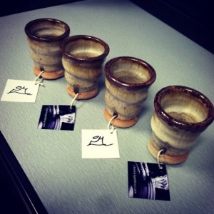
For her current collaboration with Cherrico Pottery, Joel throws clay bowls, platters, and plates for Paige to paint on with glaze materials. He then brings the painted bisqueware to his studio in St. Joseph for firing, and returns the finished pieces to exhibit in Gallery Paige.
Collaborations like these bring Joel’s work in conversation with the larger contemporary art world. His work with Paige not only diversifies his art, but Paige’s paintings come alive on Joel’s 3D pottery surfaces, meant for display and as functional dinnerware. When it comes to the collaboration, Joel says he feels honored to create pottery as canvases for Paige’s iconic paintings.
.
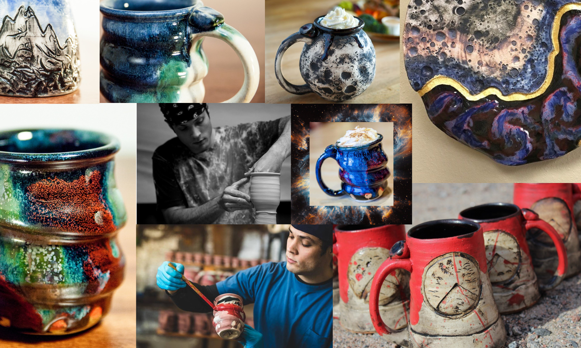
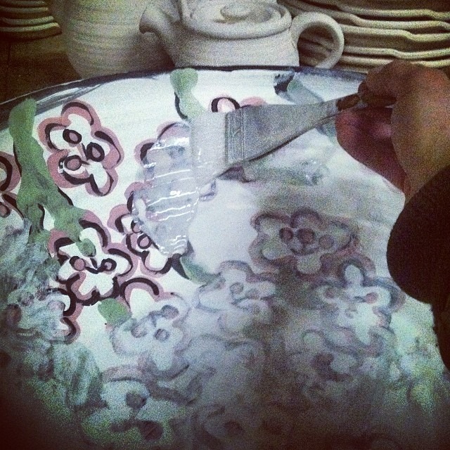
Check out the process shots below to see how these two artists come together to make beautiful works of art:
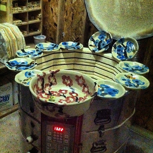
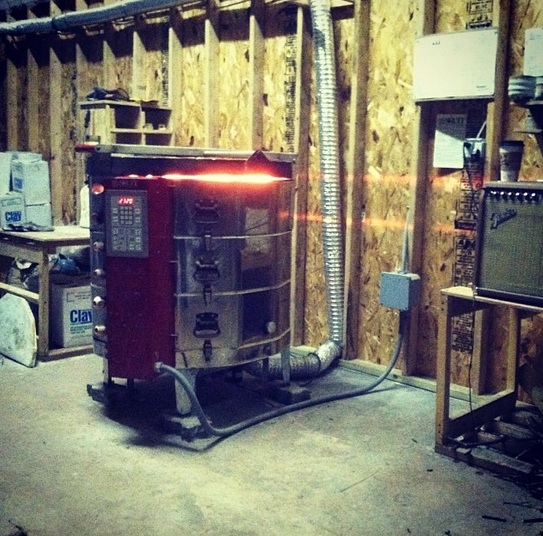
Joel first brings unglazed bisqueware to Paige’s studio for her to paint with glaze materials. Raw clay becomes bisqueware after it’s been fired once.Paige then paints each piece using underglaze materials. Her paintings typically feature a pallet of bright, playful colors and images.After Paige paints each piece with underglazes, Joel brings the painted bisqueware back to his studio and covers it with a coat of clear, glossy glaze. This will give the finished pieces a shiny, smooth surface after firing.At this point, the pieces are ready for 2200 degree firing. Joel uses an electric kiln to fire all his collaborative painted stoneware.
The finished pots will be exhibited April 5th at Gallery Paige in Minneapolis!
I remember the first time glazing a pot in Sam Johnson’s ceramics class last year. I had made this slightly uneven coil vase with pockmarked walls nearly an inch thick. The piece was truly ugly, an ogre really, but I couldn’t see the pot as anything other than beautiful. It was my Princess Fiona and I was its Shrek…At least until I glazed it.
Like most naive ceramics students, I pictured glazing just like painting. I picked out a handful of colors using the test tiles as my guide, and then brushed swooping glaze patterns all over my vase. By the time I finished, the pot looked like something straight out a kindergarten arts and crafts class. I on the other hand thought it was a masterpiece – a trophy of abstract art. When the thing (it was beyond a pot at this point) finally came out of the kiln, it was hideous. I looked over at my professor for encouragement. Sam walked over, took one look at my monster, turned to the class and said:
“Opening a kiln can be like Christmas or Halloween. Either the pots look amazing and you fall in love, or the results are horrible and you want to smash everything.”
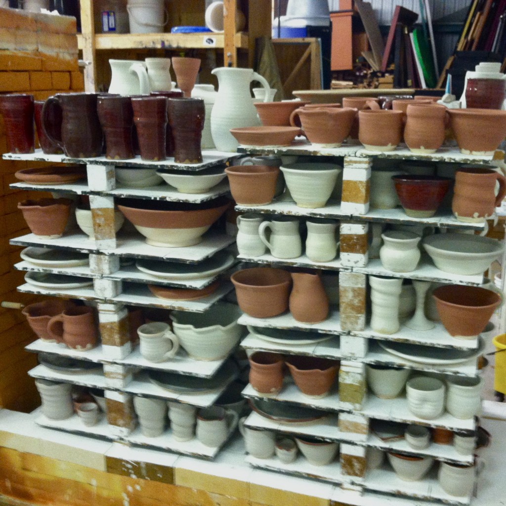
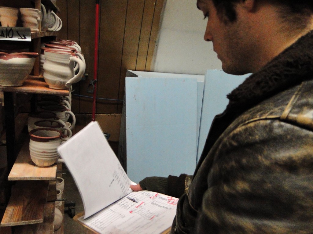
The moment of truth, loading a kiln of glazed pots.
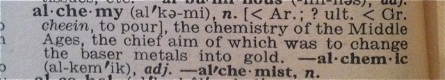
Unlike my great clay ogre, Joel can’t afford to make ugly pots. He makes his living through pottery, and as a result, his experiments with glaze need to be calculated and precise. He needs to know exactly how each part of the glaze works; how copper, cobalt, and iron make red, blue, and rust colors when the glaze reacts with fire in the kiln. Glazes transform clay bodies from ogres into princesses. However, as Joel continues to explore glaze chemistry, he finds that these potions are often difficult to create. Like the alchemists I wrote about last post, Joel works tirelessly to find the right balance of form and color that’ll turn a clay body into a beautiful work of art. For his livelihood, each glaze must reach for a certain standard of beauty.
– Studying past glaze recipes, tweaking the ingredients to make more alluring pots.
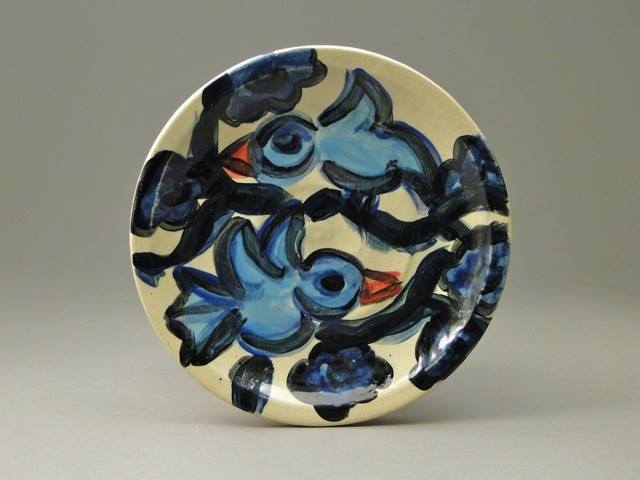
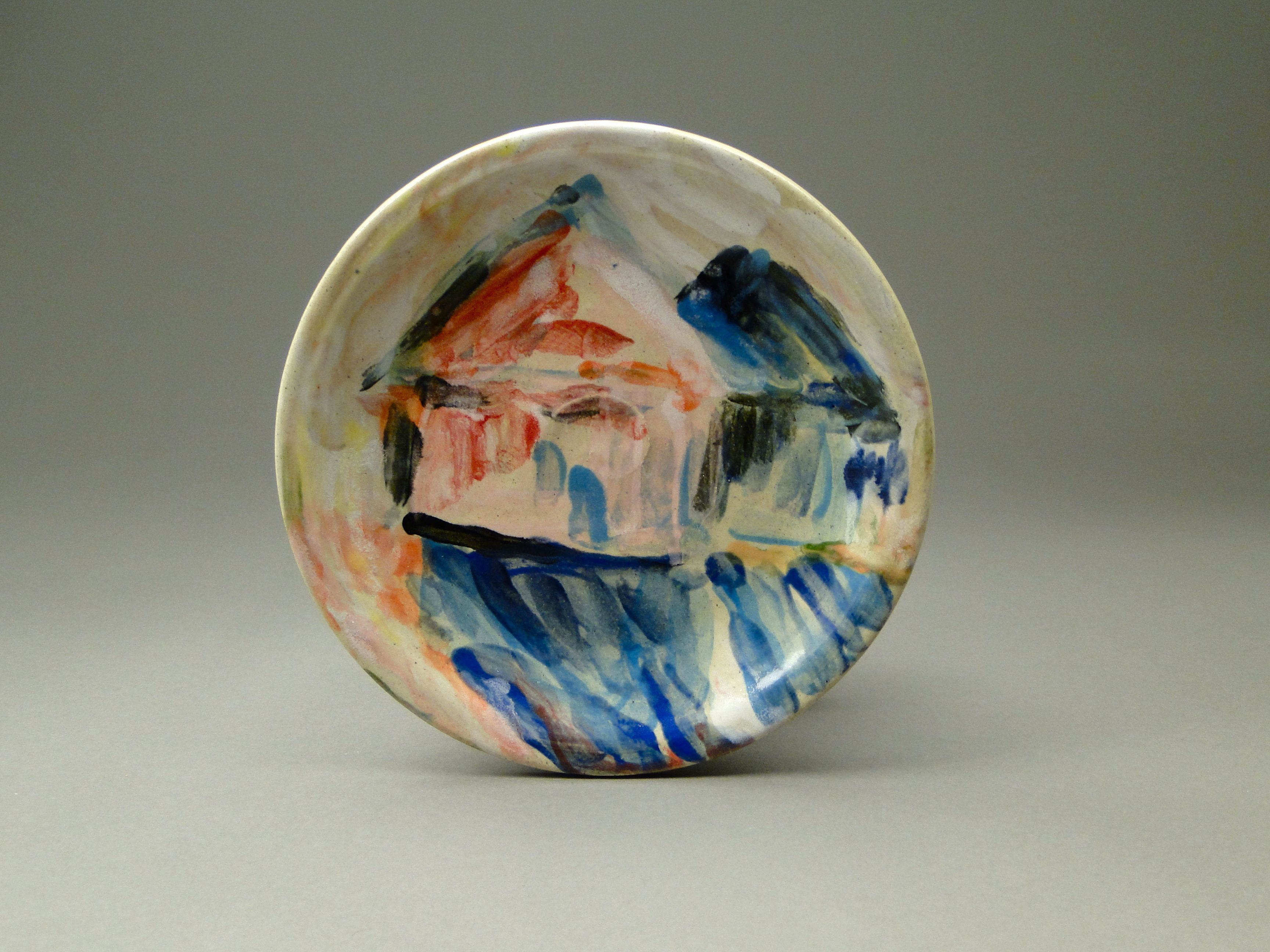
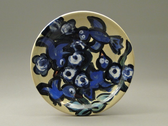
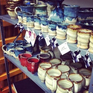
Looking back at his previous body of work, I think Joel’s been chasing this certain type of beauty all along. It’s been hidden in his work throughout the years, and now I feel we’re just starting to uncover it in the color blue.
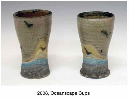
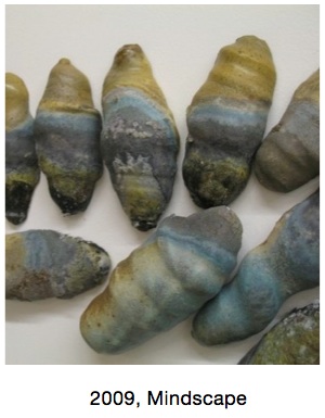
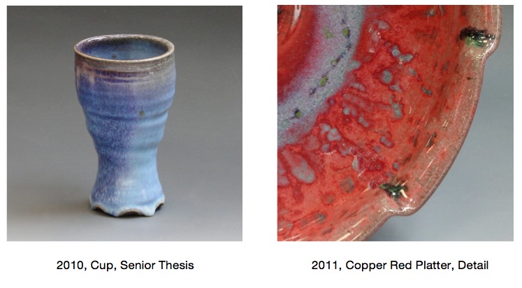
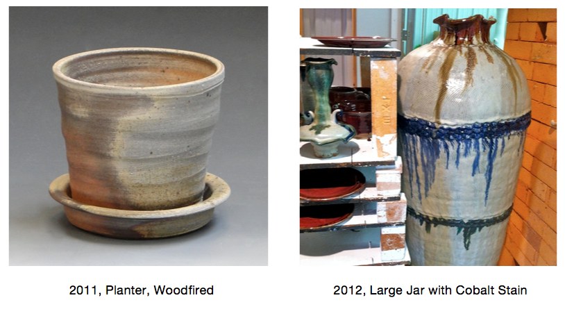
Take a look at the gallery below to see an evolution of this blue color. Even in woodfiring, salt firing and copper red glazes, the color blue shows up. I can track the color throughout his work back to 2008:
Numerous potters talk about the lore of blue pottery. Throughout the ages, potters can’t seem to shy away from it. I’ve heard some contemporary potters even refer to the color as cash-flowblue.
Our text book this semester has been Bernard Leach’s A Potter’s Book. Now a 50 year old text, Leach provides a rich history of how ceramics has evolved. His book not only offers rich lessons of the past, but it also gives insights into the future. But even Leach, who wrote the book after decades of experience under his belt, could not seem to understand the lure of the color blue in ceramics. These stories share his experiences with blue glazes:
“At my St. Ives workshop each summer we are asked by three visitors out of four for colour and yet more colour, blue and the more intense the better, is easily the favourite.”
– A Potter’s Book, page 36
“Yesterday we had a good bunch of people, 2 of whom at least knew a good pot when they saw it. One woman started by asking if we hadn’t got any ‘blue pots’, and when David showed them that the last olive-blue glaze for which we have experimented for years, she said: ‘Oh! Do you call that blue?'”
– A Potter’s Book, page 227-228
Perhaps what this all boils down to is something we talked about in the beginning -the pursuit of beauty. Some of the best potters in the contemporary art world don’t make beautiful work. Their work is strange, ugly and confusing.
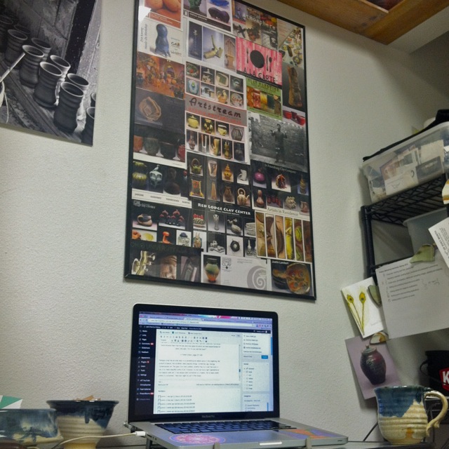
With this in mind, does the color blue still have a place in the contemporary ceramic world? This poster sits above our workspace, and it’s made from postcards Joel picked up in Philadelphia in 2010 at NCECA (National Council for Education for the Ceramic Arts). It gives a snapshot of the contemporary ceramic work, and shows only a handful of simple, blue pots. Joel will be at the conference in Milwaukee next week networking with contemporary potters and pottery enthusiasts. His goal is to show that the color blue continues to have a strong lure in both historical pottery as well as contemporary ceramics. He wants his work to be a bridge between historical potters like Leach and contemporary artists like Paige Dansinger. As a result, we’ve prepared some innovative market ideas, re-designed the website home page, and packed the online store with blue pots and artist collaborations with Dansinger. We’re prepared for the biggest ceramics conference in the country and we’re hoping to lure people to us with our blue pots!
In many ways, the work of the modern potter mirrors the work of the ancient alchemist. Potters blend earthly materials like clay, stone, and ash, into complicated glaze mixtures. Then through fire, these base substances transform into precious works of art. With glaze chemistry, and one part modern alchemy, potters turn the natural elements we once took for granted into the treasured artifacts we display in our homes and galleries.
It’s interesting to see how much the glazing, alchemy, and human life relate to each other. Bernard Leach, author of A Potter’s Book, helps us understand glazes by relating them to the body. He says most glazes have 3 main parts -the blood, bone, and flesh. Here’s how they work:
1.) Fluxing agent or “life blood of the glaze” – causes the glaze materials to melt and flow together in the kiln firing.
2.) Refractory or “bone of the glaze”– resists heat and melting, providing structure and strength to the glaze body.
3.)Glass Former or “flesh of the glaze”– creates complexity, depth and unique qualities.
(page 133-134)
Similar to Bernard Leach, the early alchemists fused their chemical efforts with the body. Calling their experiments the Magnum Opus, or “Great Work,” these men searched tirelessly for the right chemical concoctions that would enrich life or prevent death. In some ways, full-time potters do the same through glaze chemistry. They are constantly searching for that perfect potion that will immortalize a clay body and turn sand, water, and ash into gold.
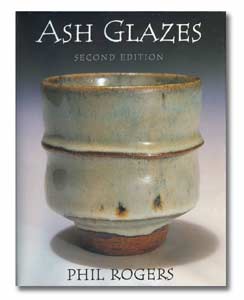
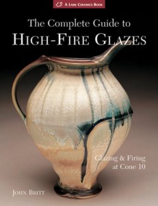
These 2 books, by potters John Britt and Phil Rogers, gave Joel the necessary skills to develop that perfect glaze surface, but like the early alchemists, he’s still searching.
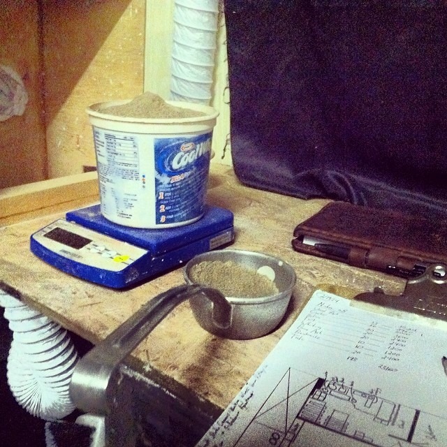
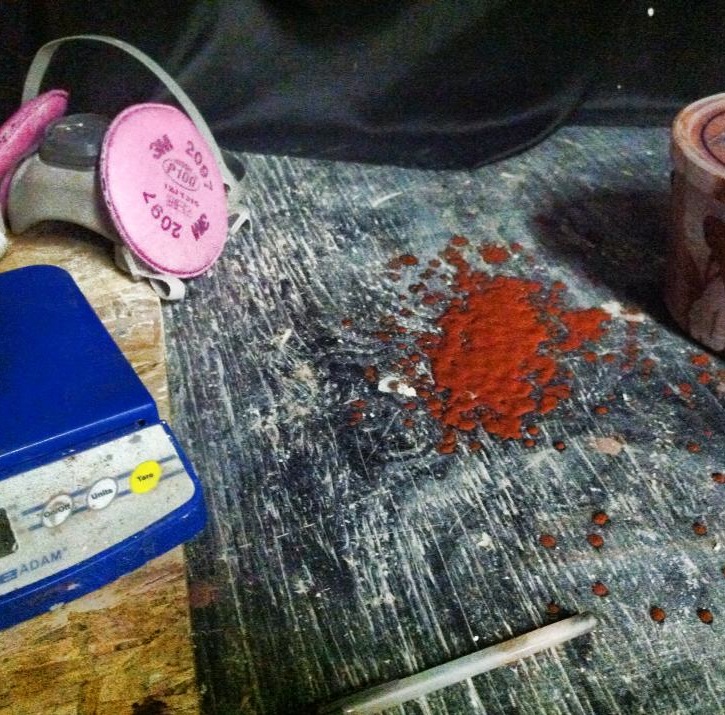
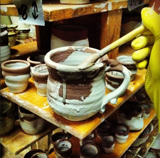
Like alchemy, glazing is often a fiery, messy, and sometimes toxic process. The kiln releases CO2, the powdered glaze materials are dangerous inhalants, and the heavy metal colorants cause skin irritation. Joel mixes all his glazing in an old boat shed. This dirty, dark laboratory gives him 24 hour access to glaze experimentation, providing the perfect amount of chaos to create beautiful works.
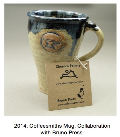
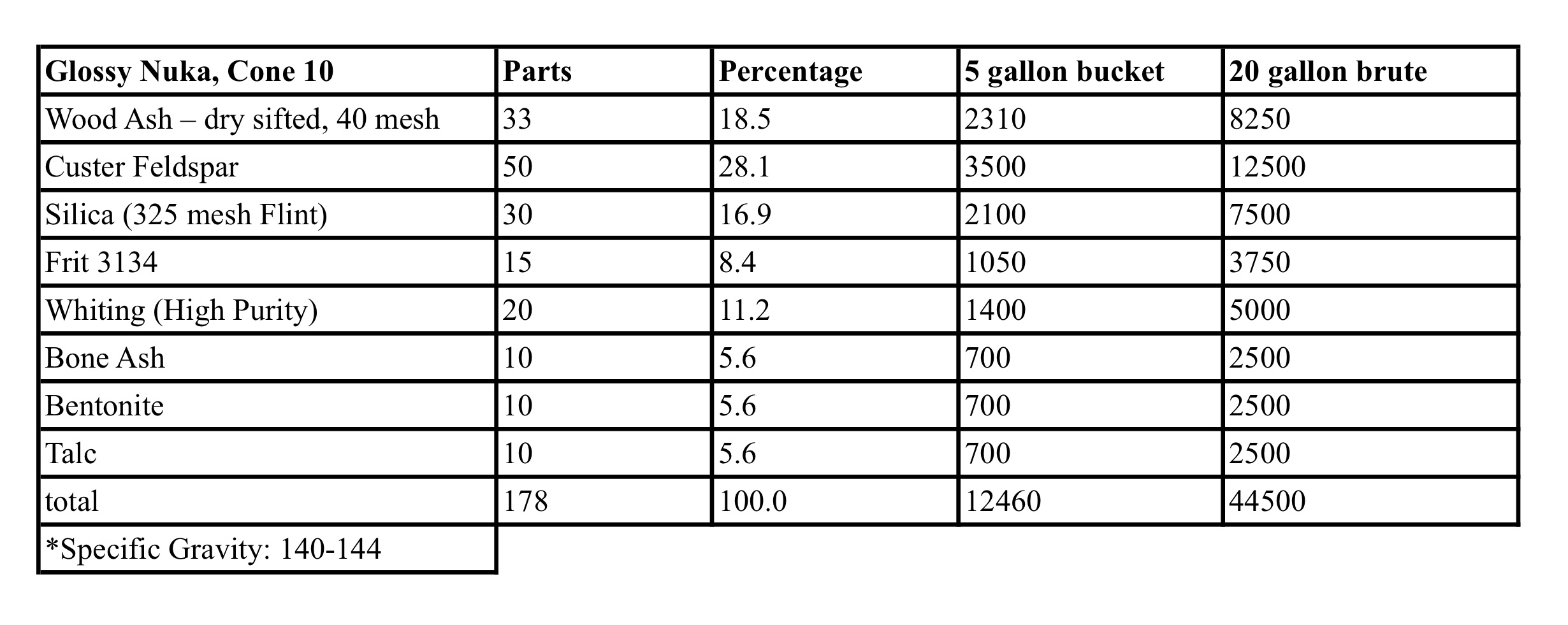
Joel’s pottery has to be strong enough to be used in a coffee shop everyday. The Local Blend Baristas say they wash a mug up to 5 times per day, 7 days per week! With this in mind, Joel adapted the Nuka glaze to suit the stress. Traditionally a simple 3-ingredient mixture, Joel added more chemicals to strengthen the glaze surface, reducing flaws like pinholes and crazing while increasing durability and gloss. Here’s the recipe for all the curious potters out there:
Some potters spend their careers trying to find the right glaze mixtures. In next Friday’s post, we’ll delve into some of these mixtures more and explore the lure of pretty blue pottery.
Cobalt-based glazes, or what some potters call “cash-flow” blue glazes, have been mystifying both potters and customers for decades.
“At my St. Ives workshop each summer we are asked by three visitors out of four for colour and yet more colour, blue and the more intense the better, is easily the favourite.”
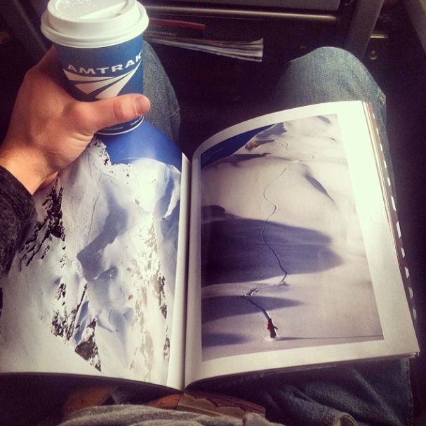
As the Amtrack roars across the plains of North Dakota, Joel watches the fields outside his window fade back into the landscapes of Central Minnesota. He reads a Snowboarder magazine to pass the time, and his mind instantly returns to skiing fresh powder at Big Sky three days earlier. Before the moment fades, he snaps a picture. Perhaps it’ll give him inspiration when he returns to the wheel. Since he was 3 years old, Joel has taken yearly trips like this one out to the Rockies. They are his second home, and as a result, they appear on his pottery. Drawing inspiration from his former professor and mentor Sam Johnson, who signs many of his pots with a simple-line landscape drawing, Joel signs each piece with an image of the mountains.
Pottery signatures offer us an intimate look at where an artist’s inspiration hides. Sam says his signature represents the flat landscape where he grew up, in western Minnesota. In Joel’s case, the mountains are a symbol of moving forward. They not only show the foundation from which he builds his art, but they show an image of where he wants to go.
“I want you to feel like you’ve got a mountain of clay to work with.” – Sam Johnson
For Joel, the mountains symbolize where he’s going. They find a home on every pot he makes.
In practically every creative writing workshop, beginning writers hear the motto, “Write what you know.” With pottery it’s no different. Potters pull inspiration from the world around them and try to bring these inspirations to life in their work. Perhaps the most revealing aspects of a potter’s art then, are the elements he/she leaves constant. The inspirations that continually find a home in their work.
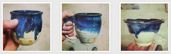
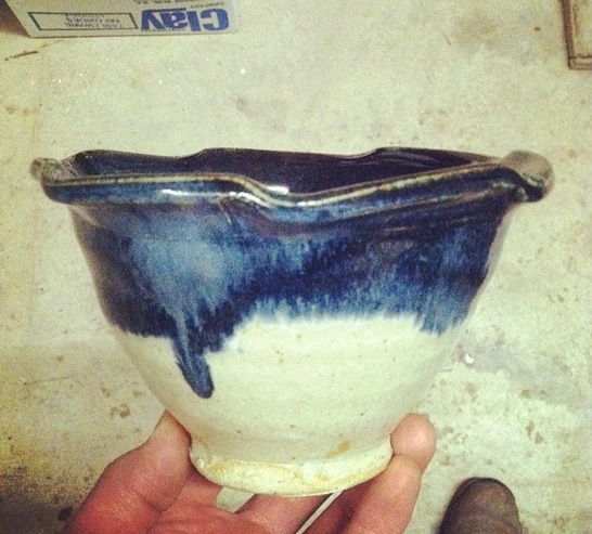
With this in mind, let’s return to the mountains on Joel’s mugs. As new life circumstances reshape his pottery, Joel still draws mountains on every pot. While he calls them, “a symbol to where he’s going,” I read them as a testament to where he’s been. They stay constant while nearly everything else changes around him, offering a link between the past, present, and future. Look at his glazing for instance. The mountains come to life in the way the dark blues meet the pale Nuka glaze like the sky meets a snowy mountaintop. In everything from his abstract expressionist glazing to his simple-line signature, the mountains are present.
The Nuka and Cobalt glazes on this bowl remind me of a snowy mountaintop as it meets the dark blue glaze near the lip.
It’s strange to think that an annual ski trip could have such a large influence on somebody’s pottery. But that’s the joy of art; inspiration hits often when the artist least expects it. He may be on a train barreling across North Dakota, and BAM, there it is. Steven Hill, a potter who I mentioned in my last post, describes finding inspiration like climbing a mountain. In Tales of the Red Clay Ramblerpodcast Steven Hill is interviewed by fellow potter Ben Carter. Hill says:
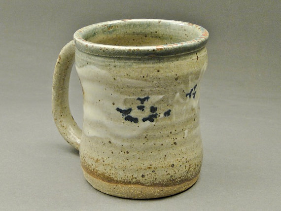
This pot shows a realistic representation of a midwestern landscape. Notice how the porcelain slip represents clouds, cobalt blue looks like birds, and raw clay near the bottom resembles a horizon line. The creamy, gray glaze feels like a winter sky.
“I feel like we all need to have something that we’re searching for that’s out of our grasp. It’s kind of like you’re climbing a mountain. Once you get to the peak there’s no where to go except down. And the search for a better resolution, a better curve, a better surface…a better something that’s always been elusive of my grasp, but it’s always been right out in front of me and I’ve never attained it.”
Successful full-time artists rarely separate themselves from their work. They always look for inspiration, even in the strangest places. If you follow Joel on Instagram, you’ll see how his obsession with rock music, rock culture, and skiing all influence his pottery. True to this culture, he even has a large tattoo of his pottery signature on his arm. Many historically famous potters spoke about synthesis of life and art. In short, the two fuel each other, providing moments of inspiration when we least expect them.
“…it is obvious that Shoji [Hamada] approached his life and work in a holistic manner, and that his workshop, house, clothes, and lifestyle were all related to his greater motivation for working in clay.”
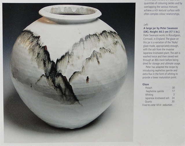
Jar by Peter Swanson, from Phil Rogers, “Ash Glazes.” Joel’s Nuka glaze recipe came out of this book, and he’s conducted over 300 tests to experiment with the glaze at varying temperatures, between cone 6 and 13. The drips of iron on this stunning pot exemplify an abstract depiction of a mountainous landscape.